You ever watch one of those organizing shows, where a team of experts comes into someone’s home and de-clutters it? The freshly painted, beautifully tidy rooms just breathe. They feel more vibrant and alive, full of possibility. Practitioners of Feng Shui, the ancient Chinese art of arranging objects in space for better health and good fortune, would say the chi—or energy—flows more freely through these rooms.
Feng Shui can be applied to all sorts of spaces, including our documents. Even if your content is strong, really important, or perfectly clear, it can disappear in a badly designed document. If you hand your students an assignment on paper and it’s difficult to follow, only the most persistent students will see and understand everything you’re trying to convey. In fact, if you’ve noticed a pattern of students not “seeing” information that is right in front of them, there’s a good chance the problem is design.
For most of us, these documents are created in Microsoft Word. And one feature of Word many of us use is the table creator. With only a few clicks, we can create a beast that looks something like this guy:
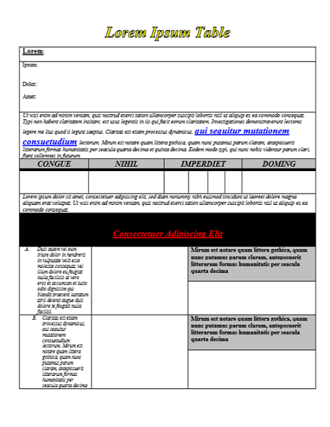
It’s crowded, lacking in balance, overloaded with outdated-looking formatting and colors. If I were a student and a teacher sent this to me, it would make me want to cry. It’s the document version of hair that’s been permed, bleached, colored and heat-styled to the point where it’s just a frazzled mess. An experienced stylist would recommend you just chop it all off and start again with healthy, fresh hair.
Using a few basic design principles—like sufficient white space and consistency in fonts—and a few tools in Microsoft Word, I was able to take that exact same table you see above and turn it into something much cleaner:
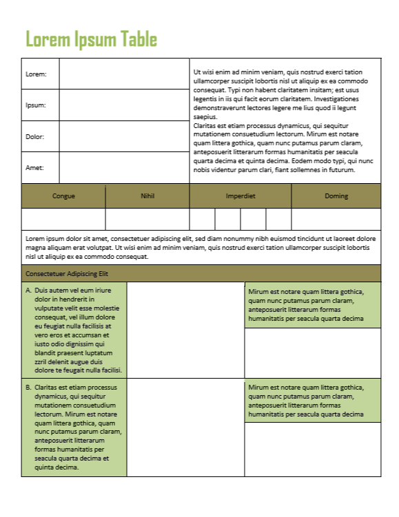
All the same text from the first table is still there, but it’s set up in a way that’s a lot easier on the eyes. More importantly, it allows the people looking at your documents to find the information they need quickly and easily—to see and understand everything you want them to see.
Improving the Feng Shui of your tables does not require a team of experts. It’s just a matter of learning a few tools you may not be familiar with. This 10-minute tutorial will show you some of these:
If you have a lot of experience with Word, these tools may already be part of your repertoire. But judging from the homemade tables I still see all over the place, my guess is there’s at least one you’re not aware of yet. If you learn them and apply them well, you’ll give your students the equivalent of a freshly painted, professionally de-cluttered room.
So get at those tables. You have important stuff to communicate…don’t let bad Feng Shui hold you back. ♦
Join my mailing list and get weekly tips, tools, and inspiration—in quick, bite-sized packages—all geared toward making your teaching more effective and fun. You’ll get access to my members-only library of free downloadable resources, including my e-booklet, 20 Ways to Cut Your Grading Time in Half, which has helped thousands of teachers spend less time grading!


Again, I appreciate the teacher side of this, but tables are also used in business. However, I actually prefer using Excel for table design over word, especially if the document is to primarily be a table. Of course, I will defend the use of tables in Word when it’s part of an overall document, but do you have a rule or a time when you would prefer the use of an Excel table over a Word table?
I have to be honest, I CRINGE at Excel. I think it’s mostly because most Excel documents that come to me are just butt-ugly, which likely comes from the same problem that I’m highlighting here — a limited use or misuse of tools to improve the appearance. Excel has some really nice-looking pre-formatted table designs, but I rarely see those in finished documents.
I would definitely choose Excel if I had to incorporate calculations or any kind of formulas into my table. Even though Word how has a feature where you can open up a mini-version of Excel right inside a Word doc, which is really helpful if you want to display a bar graph, Excel still can’t be beat if you’re working with large batches of numbers. Still, I see people get stuck in Excel, doing things with that software (like word processing) that can be done in Word with so much more aesthetic value. I think even Excel enthusiasts could probably learn from this tutorial, because even though the tools are different, the principles of font consistency, light-handed formatting, and white space would apply in either platform.
Jenn,
1. You better be turning all this stuff into a book. The Cult of Pedagogy is a definite title for contention.
2. What’s your opinion of the whole top-down notes craze? My charts are pretty good, although I do have to go back and simplify my fonts. Top-down kind of lends itself better to the breakdown of bigger ideas and I’ve tried, at times, to combine this into my charts, thereby (hopefully) teaching better note-taking skills in the process.
Nick,
1. Dude. You had me at “book.” Just waiting to be discovered.
2. Am in the process of googling top-down notes, because I don’t know what it is! Doy! Will get right back to you on that. In the meantime, why don’t you tell me what YOU think it is? 😉
Could you do something similar for Google Docs? (I’d also love it for google sheets and google draw.)
I second this! I like Google docs, but still don’t know how to use many features.
Hi, Tamara and Brittany!
This is Holly, a Customer Experience Manager. Short answer–Yes! You can do many (if not all) of these things using Google Docs and other apps in the Google Suite. Jenn has a “course” called Google Drive Basics that I’d definitely look into.
You can find it here: https://goo.gl/X8WLyH
If you have questions about specific things you’d like to try, you can email us support@cultofpedagogy.com and we can do our best to help!
Thank you, the explanation about the “bullet” and the “text” location was particularly helpful to me. I bought your syllabus as I think it is an excellent template. Well done, congrats, (and thank you!)!
Your website name is indeed a book title!