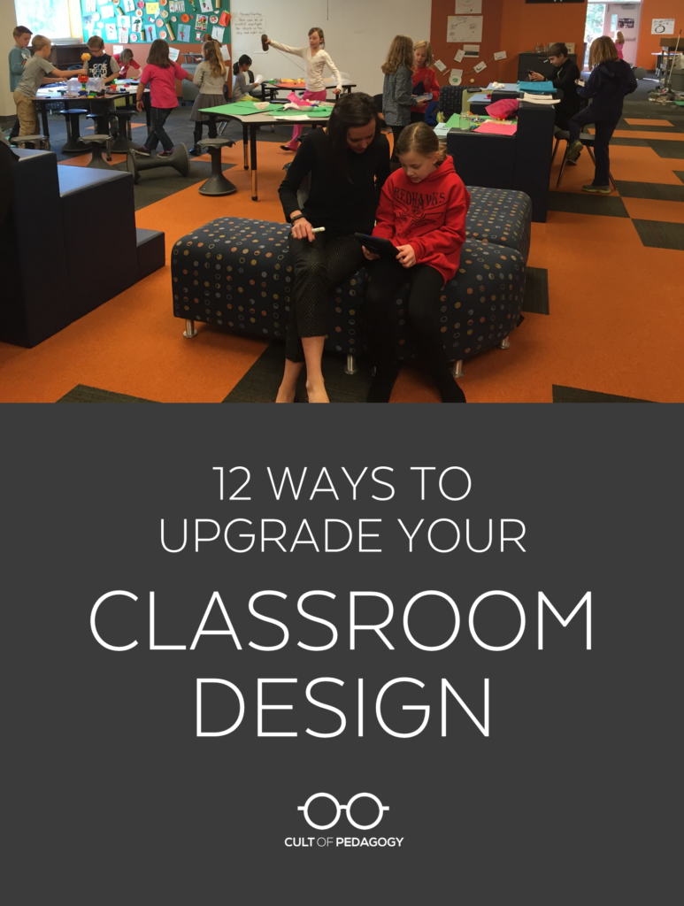
Listen to my interview with Bob Dillon (transcript):
Sponsored by Peergrade and simpleshow videomaker
This page contains Bookshop.org links. When you make a purchase through these links, Cult of Pedagogy gets a small percentage of the sale at no extra cost to you. What’s the difference between Amazon and Bookshop.org?
A couple of years ago, I saw a picture on Facebook that stopped me in my tracks: It was the classroom of Michigan high school English teacher Rebecca Malmquist. It looked like a living room. Like a place you’d go to curl up and read a book, take a nap, or have a really good conversation. And yet it was a classroom.
Now this classroom was just one particular type, a kind of shabby chic, funky, yard-sale mix, but it represented something bigger, a tear in the fabric of how we’ve always done things. It was one example of the way flexible seating and more student-centered classroom design have taken off everywhere, with more teachers breaking away from traditional classroom layouts and finding new ways to make their rooms more conducive to 21st-century learning, where collaboration, personalization, and project-based instruction are becoming the norm.
When I shared it on my website, most people went nuts, but some were discouraged: They loved the room, but there was no way they’d ever be able to recreate it in their school, with small spaces, big class rosters, limited budgets, and strict fire codes. They believed that to create these incredible learning environments, they would need tons of money and big, modern spaces to work with.
The good news is that the principles of learning-friendly design can still be applied without those things. There are plenty of changes you can make to your classroom—without a lot of money or space—to make it a much better place for students to learn.

To get some expert help on this topic, I talked to Bob Dillon, a former middle school principal who now works as a director of innovation for a St. Louis-area school district. He’s done a lot of work on transforming learning spaces, and most recently he co-authored a book on this topic with designer and educator Rebecca Hare. The book is called The Space: A Guide for Educators.
Rebecca Hare and Robert Dillon
In our interview, Bob and I talk about some of the design problems he sees most often in classrooms today, the things teachers can do to make their rooms more learner-friendly, and how to overcome some common hurdles teachers often experience when redesigning classrooms. Our conversation is condensed here into 12 specific things you can do to make your classroom a better space for learners.
1. Ask your Students
Students are the best source of information about what needs to change in our classrooms. Dillon advises us to ask them two questions. First, What’s new in the room? and second, What in this room supports your learning, and what gets in the way of it? Having students audit the room this way will help us see it differently.
“Students are going to start naming things that have been up in the classroom since the beginning of the year,” Dillon says. “When that happens, there’s a problem. All of that stuff just becomes visual noise, and it doesn’t do anything to aid the learning.”
And this shouldn’t happen just once: Dillon advises teachers to ask this question frequently, all year long. “Every two weeks,” he says, “I put it on my Google Calendar: Ask my students how the classroom is serving them.“
2. Subtract
One of the simplest changes we can make to our classrooms is to take things out. “I haven’t been in a classroom in the country that couldn’t remove 10 or 15 things,” Dillon says. “Every time a human being comes into a space, they visually process the entire room.” In many of these rooms, he says, “by the time we actually ask (students) to intellectually engage, they’re visually exhausted.”
Dillon advises teachers to take things out on a trial basis. “I tell teachers, take a trunk full of stuff—whatever size the trunk of your car is—take those things out of your classroom for a couple of weeks, then you can really make a decision on whether you need them or not.”
In almost every case, the stuff never makes it back to the room. “I have teachers over and over go, ‘As soon as I was able to actually free my classroom of some space, I was able to see what was possible.’ I think sometimes until you breathe the classroom, give it some air, you can’t even see what the next iteration is.”
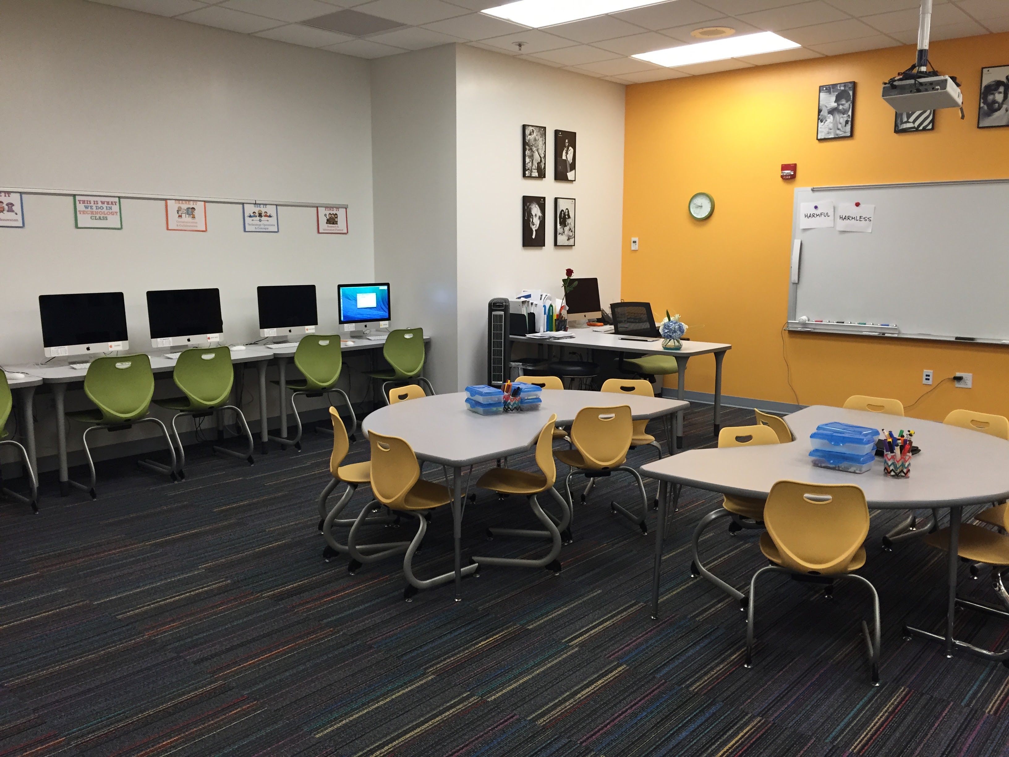
Photo courtesy of Robert Dillon.
3. Mix up Your Seating Options
Flexible seating doesn’t have to mean new furniture, hokki stools, and bean bags. Using the furniture you have right now, you can still create different seating options and give students choice.
Dillon explains how this can work: “You have 30 desks. No one’s going to take them. No one’s going to put them anywhere else. Why don’t you make one row of six, then two clusters of six, and then a long kind of what I call a ‘boardroom style’ where you have 12 desks face-to-face to each other, and then give kids choice on where to be in that classroom. Giving kids choice and agency around where they are goes a long way to saying you trust them and they own the classroom.”
One great example of repurposing what you have is Kelly Almer’s 5th grade classroom. One of her first steps toward giving students more seating options was to remove the legs from a few classroom desks to make them coffee-table height.
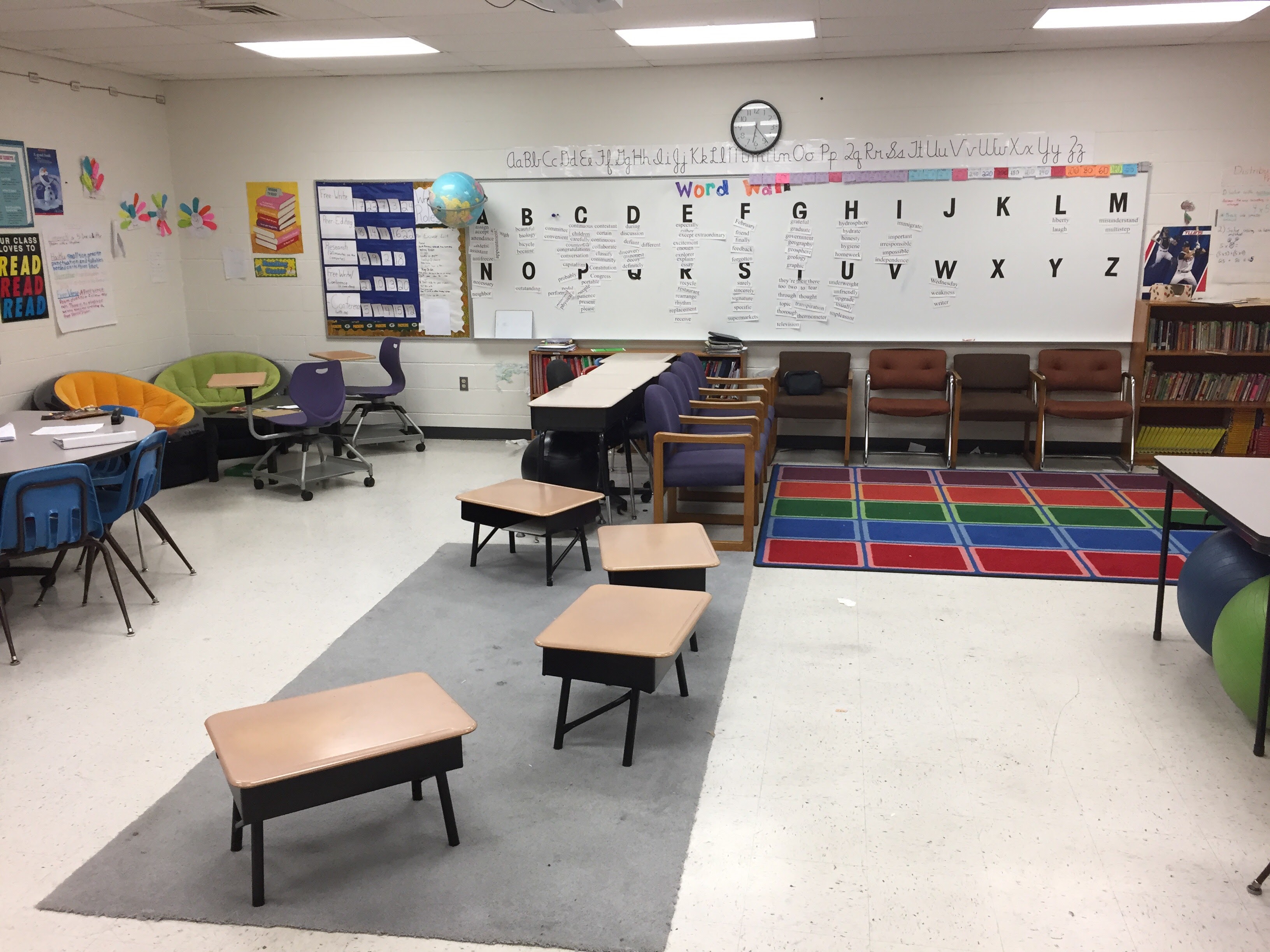
Photo courtesy of Robert Dillon.
4. Consider the Perimeter
“When we think about learning space design,” Dillon notes, “we go directly to furniture, we go directly to the floor plan of the room. But we never think about the perimeter. How are the walls, and every inch of your walls, either supporting or distracting from learning? Do we really need that poster? How do we make everything really accessible? The walls of the room are another piece of the puzzle that usually don’t take money to add to.”
5. Reduce Your Teacher Footprint
One way to free up more space is to minimize or eliminate our teacher workspace. In fact, many teachers are getting rid of their desks altogether.
“Whatever we can do to reduce our own footprint in a classroom,” Dillon says, “whether that’s pushing our desk up against the wall, whether that is letting kids know that they have access to all the square footage in the room, all of those things begin to really transform what classroom can be.”
Want to get rid of your teacher desk? This collection of resources will show you how others have done it.
6. Create Spaces for Collaboration
Desks in rows are fine if all we want to do is feed information to students and have them spit it back out. But a 21st century education demands more from us. We understand now that students need more than facts: Among other things, they need to be able to communicate well and work together to solve problems. Our classrooms need to reflect that. So when rethinking your classroom design, look for ways to make more of these collaborative spaces possible.
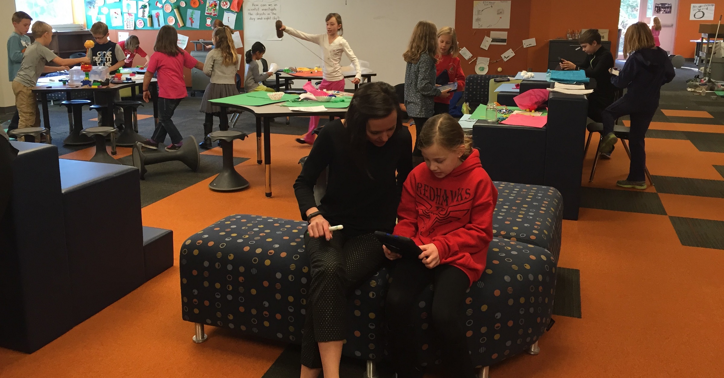
Photo courtesy of Robert Dillon.
7. Create Spaces for Creation
Classrooms where project-based learning and design thinking are taking the place of rote memorization need spaces where students can sketch, build, make, and prototype. That kind of work requires clear surfaces and centers where students can access all kinds of materials—not just typical school supplies.
“We’ve oftentimes had markers and glue and scissors,” Dillon says. “I advocate deeply for adding just a chunk of cardboard to lo-fi prototype, to be able to go to a kid and say, Hey, we just finished chapter three. I want you to go get three pieces of cardboard and summarize chapter three for me.”
Another consideration is where to store work in progress. “When you create things, you’re not going to finish them in 30 minutes,” Dillon reminds us. “You have to have a place to store them or put them away.”
8. Create Writable Spaces
One specific type of space for creation and collaboration is what Dillon and Hare call a “writable space.” In many of the classrooms Dillon visits, “Teachers own a lot of the writable space. There are teacher words up, there are teacher posters up, there are things on that writable space. I would give more writable space back to kids for them to process and sketchnote and get all their things up on the board.”
Handing over more of your existing boards is a great start, but you can add more writable spaces by purchasing inexpensive personal dry-erase boards, a free-standing dry-erase easel, or by making your own whiteboard tables or adding an extra DIY whiteboard for very little money.
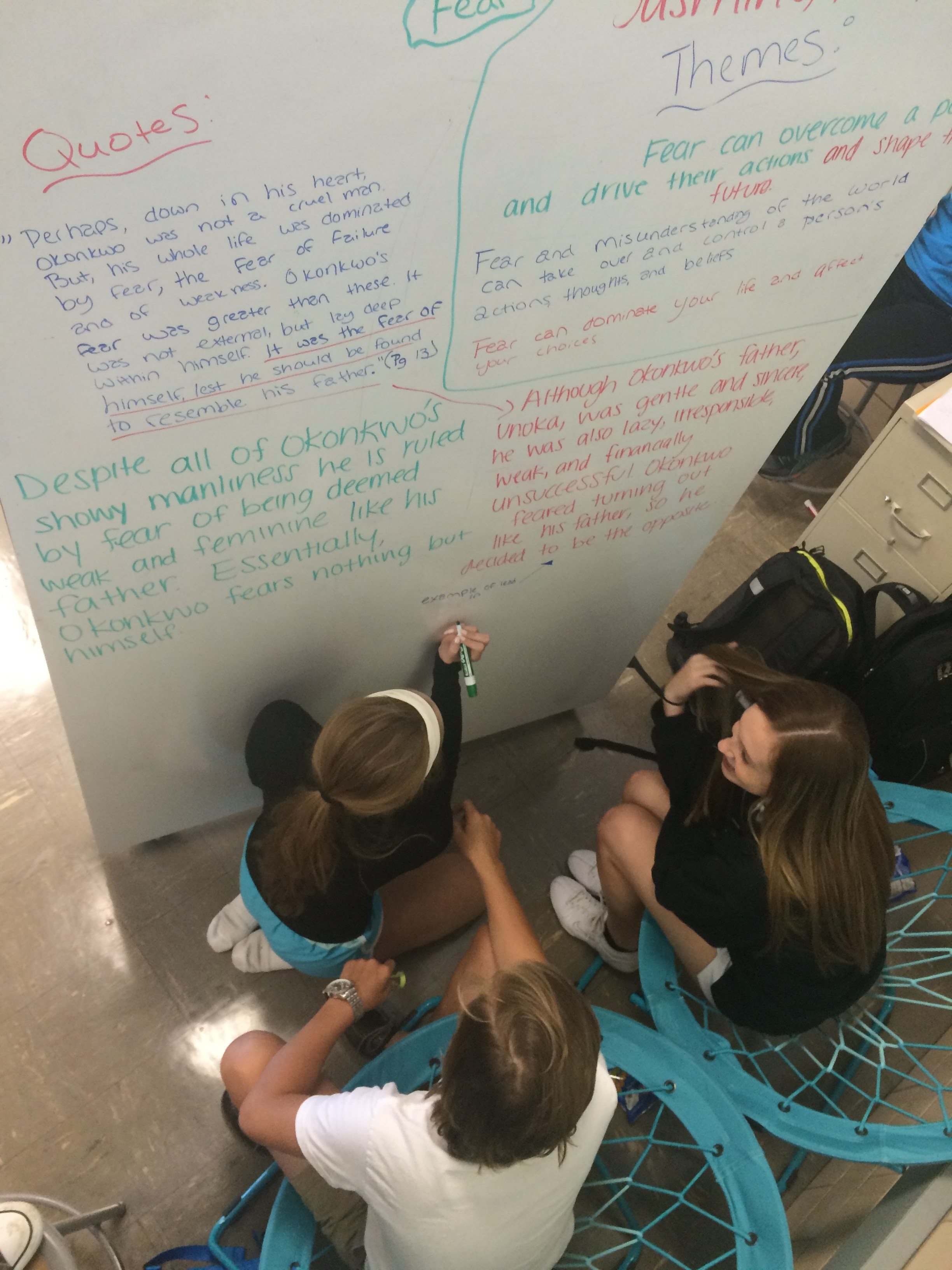
Photo courtesy of Robert Dillon.
9. Create Spaces for Quiet
“We have a lot of kids that come to our schools that are stressed out, that are impacted by poverty on a daily basis, that need a quiet moment in their life,” Dillon says, “and we want to make sure classrooms can be safe, caring, and trauma-informed in the work they’re doing. I think that really good learning space design, first and foremost, cares for kids and takes care of their needs so that then learning can really happen. A lot of classrooms certainly have a place where they send kids to reframe and rethink. But for us, we want to make sure all classrooms have a space to validate introverts, reflection, and decompression.”
When we don’t have these spaces, our kids find ways to get the quiet they need: “Here’s what’s going to happen: They’re going to raise their hand and say, Hey, can I go to the bathroom? Right now, our bathrooms are our spaces for quiet for kids,” Dillon points out. Half-joking, he adds: “Fifty percent of middle-school kids that need to go to the bathroom just need to move; they just need a moment.”
Setting aside quiet space in a crowded classroom can be a huge challenge, but Dillon says doing this successfully is more about classroom norms than space. “(It can be) a portable whiteboard that gets pulled over into that space that kind of blocks somebody off, a comfortable bean bag on a floor that’s behind a bookcase, a desk where if someone goes over there, the norm is that you just leave them alone. If we are just open, honest and transparent about why, kids respond to that really well. Spaces for quiet don’t have to look fancy. They are just the norm in that space.”
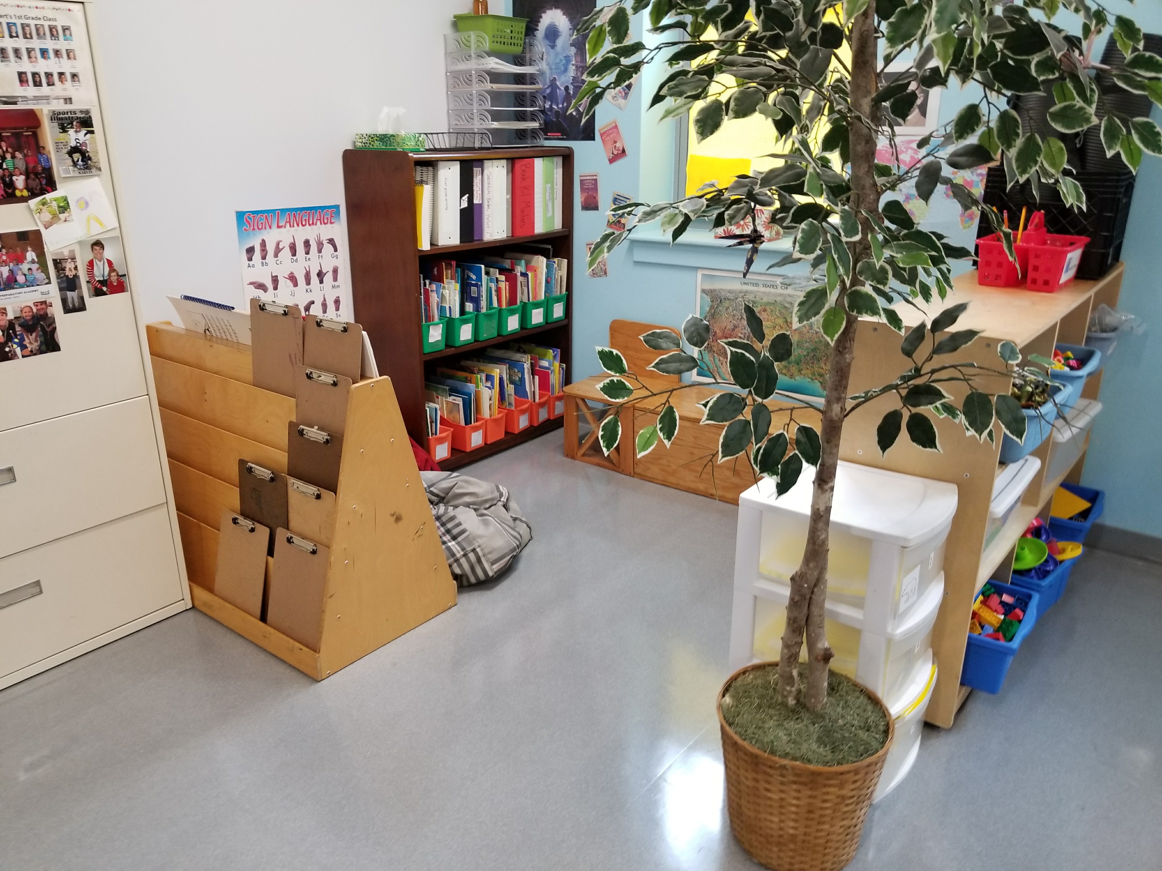
Photo courtesy of Robert Dillon.
10. Create Spaces to Showcase Learning
Both Dillon and Hare happened to send their children to schools that used the Reggio Emilia approach, which emphasizes documenting and displaying the learning process, not just finished products. So they apply that philosophy to the spaces they help design, and they advise teachers to keep looking for ways to display student learning in their classrooms.
What does that look like? “Sometimes that can be an ongoing list of ideas surrounding a central question,” Dillon explains. “That can look like pictures of kids working in a classroom that are up where folks are putting sticky notes on those, either praising what’s going on or asking questions. But all of it showcases that learning is messy. We’re in a process, we’re in a growth process.”
(P.S.: I am now completely in love with Reggio-inspired classroom design. Look at this classroom, and this one, and this one.)
11. Narrow Your Color Palette
Designing a learning space isn’t the same thing as decorating it. When our spaces are put together without an understanding of what works best for learning, Dillon says, “You have classrooms that look like a bag of Skittles.”
Rather than fill your classroom with lots of colors, try to narrow your color palette to three main colors: One neutral, “a kind of base color, whether that’s some sort of tan or some sort of gray,” and two accent colors, “colors that can really kind of pop.” Doing this will reduce visual noise and allow students to focus better. “Kids notice,” Dillon says. “There is a coherence, there is a calming, it feels comfortable.”
Making this kind of change doesn’t happen overnight. Start by figuring out if your classroom already has the beginnings of a palette. The key is to figure out what that is, then start to eliminate some of the things that take away from the coherence of that palette in your room. “There are a ton of programs out there, like Canva,” Dillon says, “where if you take a picture of your classroom and it will tell you the color palette of your room.” See if you can identify the three main colors you’d like to work with, then start moving closer to it with wall color, storage containers, and other accessories.
“When I buy new things,” Dillon says, “when I take things away, I want to get closer and closer to these three colors. That can’t happen in a year, for most places. But it can be a journey that you’re on to get closer and closer to a color palette that’s coherent.”
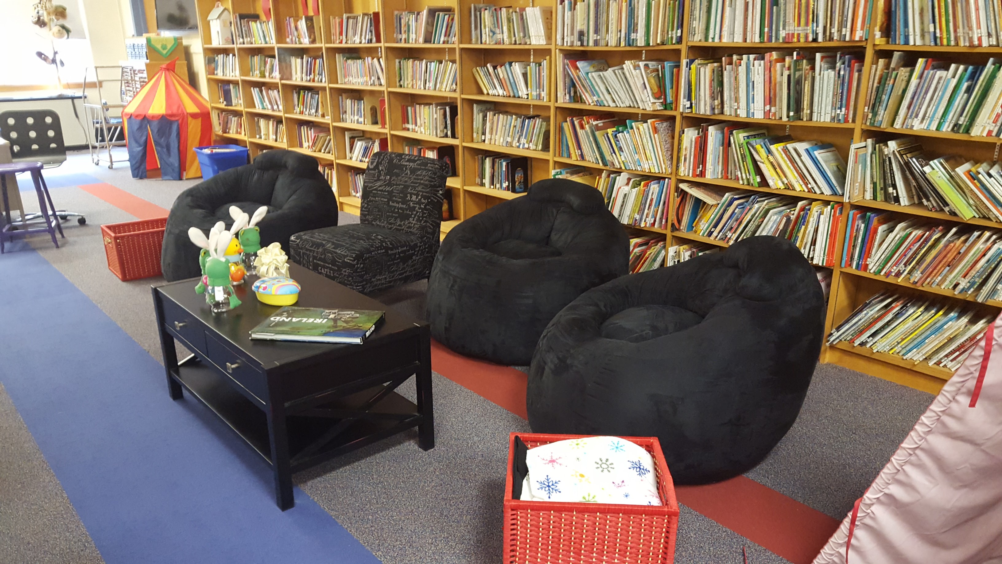
Photo courtesy of Robert Dillon.
12. Utilize the Hallway
“A third of all the square feet in schools is hallway,” Dillon says, “and we don’t use that for learning like we could.” So when rethinking your classroom space, remember that you can extend learning beyond the walls of your classroom. One teacher Dillon worked with would roll two small tables out into her hallway every morning and invite kids to use those surfaces for certain activities.
Never Finished
If the thought of completely redesigning your classroom is overwhelming, remember that this is an ongoing process. “Learning space design isn’t like a, ‘I did learning space’ checkmark for teachers,” Dillon says. So rather than trying to overhaul everything at once, start with small changes, include students in the process, and iterate as you go. “It’s a journey, and it’s always about tinkering.”
Learn More
In addition to The Space, Dillon recommends these books for digging deeper into classroom design.
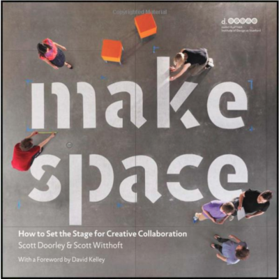
Scott Doorley & Scott Witthoft
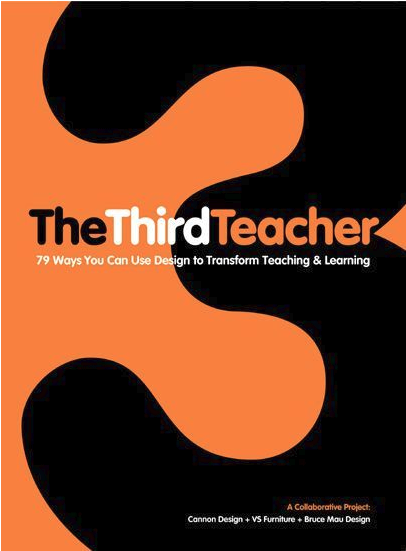
Cannon Design, VS Furniture, and Bruce Mau
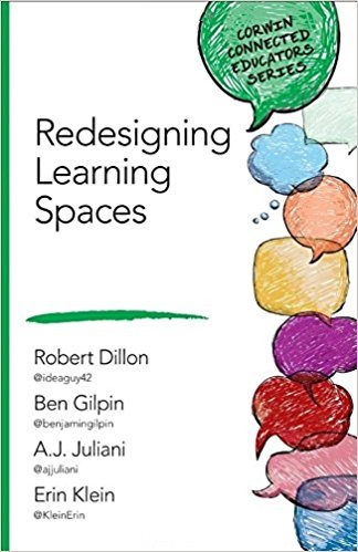
Robert Dillon, Ben Gilpin, A.J. Juliani, Erin Klein
Find Bob Dillon on his website at drrobertdillon.com or on Twitter at @ideaguy42.
Join my mailing list and get weekly tips, tools, and inspiration that will make your teaching more effective and fun. You’ll get access to our members-only library of free downloads, including 20 Ways to Cut Your Grading Time in Half, the e-booklet that has helped thousands of teachers save time on grading. Over 50,000 teachers have already joined—come on in.



I’ve been trying to slowly move towards this kind of environment for the past few years but the piece I still struggle with and would LOVE to hear from other middle school teachers about is the self-selection of their seats… I still do seating charts because I haven’t found a better way of making sure students are getting to know different people in class. I’m big on team building activities and class community building throughout the year. We do lots of partner/group work where they are mixed in with more than just friends. BUT I see the most friendships develop when they are sitting next to a student they haven’t really talked with before… I would love to give more student ownership over seating but I also feel that sitting with other people is a really important piece. (For context – I teach in grade 6 in a gr. 6-8 middle school so this is their first year coming together with students from 3-4 different elementary schools)
Don’t feel like you have to always create seating charts or always let them self-select. I change up the desk arrangements weekly, if not more depending on the lesson design. If it is a day that a lot of partner work (mini lessons) is planned, I ask them to choose their seat based on who is their best “learning partner.” Most choose wisely, those that do not, I move to a more successful location. On days with collaborative groups, I put names in a pile on each table pod and they choose where in the pod to sit (I still selected the best teams). And on days with guest teachers…you bet there is a seating chart…they need one. When I ask for student feedback about what they like best about class, MANY say the ability to choose seating.
Thanks for this comment. I comes up a lot in my work with schools and districts around the country. Choice is often seen in an all or nothing game, and I would claim that it is a journey. It may be a journey that we are always a bit conservative with, but success in redesigned spaces comes from the teacher knowing their kids and understanding the change arc that is truly possible within a given time period. I would say that you should be looking to model choice in simple things before you move to choice in seating.
You could always have them fill out a survey every week or month, or however often you want to change seating. Then ask them, who they have sat with, who they would like to sit with, and at 1 person they don’t know but would like to know. Then arrange your seating chart based on that information. You wouldn’t have to give them all their choices but could try to incorporate their wants into socializing them with people they are not afraid or shy of meeting. Eventually they’ll all get to try sitting next to each other for a period of time. I have had great luck using this idea with my 6-12th grade students. They get input but I can still help facilitate new friendships.
Thank you all! Those responses were exactly what I needed to get my head around it all. Just like everything else it doesn’t have to be all or nothing – in this sense I think I already do offer a lot of seating choice in my room but just felt like I didn’t because I use seating charts/name tags.
I’ve been working with a teammate to redo her classroom. This was a great read, and it gave me some more ideas.
Thanks!
Another tip is to use the school library. Libraries are often designed for collaborative work and flexible usage. They typically have comfortable spaces for students to sit and read as well as computers and tables for group work. Check with your librarian, but they usually are happy to accommodate whole classes as well as small groups or individual students. It’s a great way to give students more flexibility.
Hi!
Currently, I am a student teacher who is finishing up her Master’s in Secondary Ed/ ELA (went straight through school like a complete crazy person), so I am just starting to imagine different ways I would like to organize and design my classroom. These design ideas look gorgeous, but I am just wondering, would you recommend trying something like this as a first year teacher? I know that the arrangement of desks has a lot to do with classroom management style, and as a new teacher, I want to know how to balance new ways of designing my classroom with realistic management needs. Also, I am a bit worried about the part of the post that mentions “desks in rows” are a bad thing. Is this true? Obviously, I have no clue, and I have been taught to keep desks in rows and in more heavily-structured positions to help classroom management, which is honestly one of my biggest worries as a newbie. Any advice would be welcome.
Thanks!
(P.S. I tried a couple of discussion strategies from this site with my 12th graders, and they worked great!)
Hi Paige, when we look at the idea of desks in rows being ‘bad’ , we really need to look at the idea of the role of the teacher in education. Rows of desks were great when the teacher was the holder of info (‘sage on the stage’) who needed all student eyes of him or her while giving lessons. In this day and age, students have easy access to all the info we could imagine and the role of education has to shift in order to help students develop the skills they need in today’s world – collaboration, critical thinking, design thinking, etc (search for ’21st century skills’ to read up on this)Students need to be able to move, chat with one another, use different types of seating/tables according to what they are doing, etc, so…rows of desks are no longer are that useful in a learning environment.
Thanks for the reply! I am always happy for anyone to explain / give advice to me as a new teacher. I definitely understand where you are coming from, and I agree that alternative spaces and design for classrooms sound interesting and obviously work great for some teachers. I am just concerned about realistic classroom management techniques in relation to this topic. I do not have my own classroom yet, but I think I would be too scared to try something like this when my own confidence in managing a classroom is probably less stable than a veteran teacher’s would be. All of the advice I have been given by teachers in my practicum placements ( in urban, suburban, and rural settings) has mainly consisted of how I need to be highly-structured in classroom organization when I first start. So, maybe this post is a great idea for the future, when I feel more secure in my classroom management skills.
I was told, “Percy, make your classroom fit your personality.”
It was the best advice ever. Classroom management is nearly entirely now handled by my classroom.
The issue we have in adapting to this is the long and ultimately conservative nature of education.
I reflected for months about what to do with my space. I visited comfortable classrooms on campus and tried to pinpoint what I was drawn to, where would I most like to sit. The process made me reflect on those spaces I was most productive in during 11 years of college and 2 Masters. I researched color psychology for the emotion and result I wanted in my students.
I removed chairs and tables and recreated spaces with wiggle seats and bean bag chairs. The whole room is purple with flourescent green trim, every chair and accessory matches – withing range – the trim.
My room no longer assaults students. It welcomes them. I no longer have to worry about classroom management because my room calms them and encourages engagement. They are even policing each other, cleaning up, and taking ownership.
Put in the reflection to really process this from what the perspective of what a traumatized student needs, the classroom manages itself.
Thanks for your comments. The desks in rows are usually a symbol of a teacher led class, but the rows themselves aren’t the issue. Moving to a more flexible environment should be coupled with a shift in control of the classroom. Classroom control or management is different an orchestrating learning. As a first year teacher, I think that it is worth exploring all of these areas, gaining feedback, and iterating quickly. It will allow you to grow into a master facilitator more quickly.
This is so great and I wish so badly I could make it happen in my classroom! The problem is that our classes are over-populated. I teach high school and we have 40-45 kids in each class and the only way to make all the desks fit is to have them in rows. I am frustrated because I know that learning and collaboration work better in different arrangements but it’s not very feasible for me at this point! I’ve even asked for tables instead and been denied. Any suggestions would be great!
Hey, Brielle.
Bob will likely be jumping in every once in awhile to reply to comments, but in the meantime, you might want to reach out to him via Twitter @ideaguy42. Also, check out his reply to Paige – it’s a nice reminder that flexibility is not as much about desks being in rows as it is about a shift toward student-centered learning.
I’m inspired and challenged. As a science teacher I’ve come to recognize that these showcased classrooms are often the humanities classrooms– are the living rooms of our our lives while my science classroom is the kitchen, often with dishes in the sink. I’d love to see examples of “updated” middle school science classrooms, where the space is multipurpose for both table top labs and lessons.
Thanks,
Jessica
What clear, concise advice! Also, having the class create spaces or centers through changing formations, for example, moving desks or tables to create areas for art centers or collaboration or literary teams. When the allotted instructional time is completed during the class period–return the furniture to the original places. And the students get some physical activity, too.
Why is this so popular? What happened to having a welcoming / inviting classrooms? What’s the deal with wanting a lounge?
I hear about teachers dumpster diving, purchasing crappy furniture, and spending over $300 on random items. Why trade uncomfortable desks for uncomfortable IKEA seating?
Some of these teachers are trying to be “cool” and aren’t teaching curriculum / standards because they spend all their time rearranging furniture and recreating seating charts. Does anyone else find all this lame? Where’s the research stating this improves learning?
So many ways to engage students…and teachers are wasting time with this…
Here are a couple of research-based articles you might be interested in:
Flexible Seating and Student-Centered Classroom Redesign and 10+ Tips for Using Brain-Based Methods to Redesign Your Classroom.
Thanks for the inspiration. I’ve made some changes to create different spaces for quiet work and collaboration in small & larger groups. I can already see the students taking more ownership of the space. I’ve never had to remind students so often that class has ended, and it’s time to go!
I’ve just sent out my first questionnaire to get feedback.
Another resource for teachers who question the validity of changes like this to the classroom environment is The Third Teacher.
I had been thinking about waiting to survey my students before completely setting up my room this year. This article has validated many of my ideas, and has given me many more ideas as well. Sometimes as adults, we think we know what kids find appealing, but we are not always right. What better way to find out their opinions than straight up asking for them! Thank you!
When kids have a stake in the structure of their classroom, engagement and behavior improve. Setting up a classroom is also an activity rich in teaching opportunities for all students.
I found it very interesting that a good classroom design changes up the seating arrangements in order to let the students “own the classroom”. My daughter is going to be starting the 4th grade soon, and she is concerned that she won’t be able to interact well with her classmates. I will be sure to suggest to her that she looks for a desk arrangement that is very inclusive of others!
I love your ideas but my admin. would have a fit if I painted tables or move desks into the hallway.
Hi Carol! Every school is different, but maybe there are other ideas in the post that you can put in place to impact learning?
This is the worst idea i have ever seen I have no more space in my room to walk! I hate the DIY wall nobody writes on it and it is not interactive or fun to the kids. I got a circle table and there is no room to put anything on the table and there project or worksheet falls right though the hole in the middle.
Hi Mrs. Patterson! Which of the ideas here are you referring to? Most of this post suggests general ideas like asking students for suggestions, cutting back on unnecessary decoration and furniture, and creating spaces for quiet and collaboration. If circle tables and DIY walls aren’t working for you, I would suggest you talk with your students about other ways to make the room work for you.
thanks for the information
I really appreciate that you mentioned that students will let you know how the classroom is serving them, and what you can do to improve. I would have never thought about this, but I think art can be a really important aspect of a classroom or a building in general. I need to talk to my boss to see if we could include some murals that the children can relate to.
Great article. The picture on suggestion #6 shows part of a kiva setup next to the teacher. I’ve been looking all over online for two years to find something like that for my classroom. Is there any way to contact the teacher and ask where she got it? I appreciate this so much!
Hey Sarah, you might check out this comment from Debbie that includes Bob’s Twitter handle. Reaching out to him via Twitter might be the best way to get an answer to your question. Thanks!
I work in a CTE (Career Technical Education) center in Grand Rapids MI. I am a Culinary Arts Instructor and this article and interview were interesting to me particularly because we spend very little time in the classroom and much more in a lab setting. However, many of the points discussed apply to what we do everyday in the lab. We do well on the collaboration and creation spaces as we are producing and discussing ways to improve on our work daily as a part of our production process. It is interesting to me to see the different challenges teachers face when working within the space provided. We are fortunate in our school to have both resources and support for creative learning and the creation of environments to support and expand learning opportunities and to showcase the learning on a daily basis both internally and externally.
I’m a student at a community college, for a project we are yo create a classroom. What software should I use?
Hi Jean,
Although I’ve never personally used these tools, take a look and see what you think: Classroom Architect, Scholastic’s Class Set-Up Tool, and MyKaplan Classroom FloorPlanner.
Add COVID- and I am having significant issues with distancing, sanitizing etcetera and it has wrecked havoc on space design. I was hoping that the 2021-22 school year would be absent of previous COVID protocols, but the new variants are making this unlikely. Any suggestions?
Hi Janet, thanks for this thoughtful (and timely) question. As a teacher myself, I know how challenging it is to create a student-centered, comfortable space while still adhering to those equally important safety protocols. We are all doing the best we can under the circumstances, but my advice is try out the suggestions that are possible, while holding off on some of the others for now. You can still use your wall space strategically, offer some (socially distanced) flexible seating options, and involve your students in the design process whenever possible. Good luck!
So, I’m totally changing up my classroom in the fall! Hopefully, it will make a HUGE difference in my teaching style!
That’s so exciting! New furniture or layout can definitely improve the quality of the classroom experience, especially if students are able to move and talk comfortably. Keep in mind that if the first attempt doesn’t work, it’s ok to keep tweaking things until it feels right!
While I agree with many points in this article, especially reducing classroom visual clutter to enhance student learning, there are some points of disagreement.
I think it’s important to point out areas of contention because sometimes educators feel like they’re doing something wrong if their classroom spaces are not following current trends. I use the word “trend” because I have yet to see overwhelming data that concludes that sitting children in groups of other children, or in flexible seating spaces far removed from the center of instruction, is definitely best practice. From one teacher to another, it’s okay if your kids are seating in individual rows facing the teacher.
Furthermore, we need to stop treating professional educators as second class citizens. I do reject the idea that my “teacher footprint” needs to be reduced to the point where I do not even have a workspace. How is that best practice? Students do not own the classroom, and there are some areas that children do not have access to. Just because students are within a school to be educated, does not mean that they have unfiltered access to every square footage. As an adult, professionally and personally, I have the right to have a workspace within my classroom that is off-limits to students. From one teacher to another, setting boundaries with your students is okay.
That being said, I have combined my desk area to also be a small group work table and this set-up has allowed me to be efficient with space.
Celeste,
Thank you for sharing your thoughts on this. You raise an important point that teachers have the right to decide how their classroom space best suits them as well as meets the needs of their students. For some teachers, that means taking out some furniture like a desk. For others like yourself, having that desk helps us to stay organized and grounded in what we need to do. I guess the moral of the story is do what works for you!
I love creating a space to showcase and utilize the hallway – I do both and the students love seeing their art work displayed. It gives the hallways beauty for the entire student body to enjoy. Thank you for the list!