(Before I start, I should mention that I am over 40.)
I learned to type in 1987 on an IBM Selectric typewriter. A typewriter, not a computer. We had those, but they had big, actually floppy disks and honest to God, no one had any idea what to do with them. My semester of typing remains one of the most valuable classes I ever took in high school — I can still dazzle small children with my ability to make words appear on a screen by just hysterically wiggling my fingers on the keyboard.
But one rule from typing class has definitely expired, and if you’re over 40, it’s possible that no one has given you the message. Here it is:
Unless you are typing on an actual typewriter, you no longer have to put two spaces after a period.
Or a question mark. Or an exclamation point. The rule applies to all end punctuation. Just one space. Really.
Yes, really.
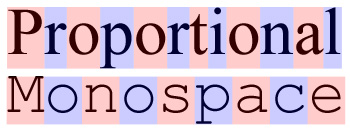
Here’s why: Back when we used typewriters, every character was given the exact same amount of space on the page. That meant the letter i was given the same amount of space as the letter m, even though it clearly didn’t need it. This is called monospaced typesetting and it’s, well, spacey. We needed that extra space between sentences to make it easier to see the beginning of new sentences.
Word processors and computers and everything that is not a very old typewriter use mostly proportionally spaced fonts, which adjust spacing to the size of the letter. That’s why a proportional font can squeeze 12 letters into the same space where a monospace font can only fit nine:
If you do even a little bit of research on this topic, you’ll find plenty of articles practically begging you to stop using two spaces. Slate‘s Farhad Manjoo went so far as to say that it is totally, completely, utterly, and inarguably wrong.
But these articles are not reaching everyone, probably because for many of us who learned to type before computers, it was hammered into our heads over and over and OVER again to use two spaces. We got our papers marked wrong if we didn’t. It takes a long time to unlearn that. And until you unlearn it, you’ll probably force this funky old rule on your own students. I know I did: I remember sitting in a computer lab in 1998, going through my students’ papers, marking all the places where they needed to add an extra space after the period. It wasn’t until 1999, when I got a copyediting job with the New England Journal of Medicine, that I learned the “new” rule.
When you know better, you do better. I love you, fellow middle-aged folks, but it’s time we all join the modern age and spend just a little less time leaning on the space bar.
That is all. ♦
[Actually, that is NOT all! See my follow-up post, written two months later…The Price of Snark: What I Learned About Teaching from a Viral Post.]
For the most part, this site is about teaching. So if you happened upon this article AND you have an interest in education, you need to stick around, baby. Join my mailing list and get weekly tips, tools, and inspiration — in quick, bite-sized packages — all geared toward making your teaching more effective and joyful. To thank you, I’ll send you a free copy of my new e-booklet, 20 Ways to Cut Your Grading Time in Half. I look forward to getting to know you better!


Oh man do I feel old! I can and will teach my teachers to teach their students this new age rule 🙂 but man, I’m not sure I can change this in myself! I always thought I was being sneaky when I used single spaces after a sentence in a paper I was too wordy for the APA page limit, blowing my mind here! I JUST PUT 2 SPACES EVEN THOUGH I WAS TRYING NOT TO!!!! And I did it with my thumbs on my phone!!! How long does it take to change a 40 year habit? At what age do you get grandfathered in to forgiveness for extra space?
Well, here’s a new wrinkle: One of my facebook readers pointed out the although APA guidelines at one time reduced the required spacing after a period from two down to one, they returned it to two in 2009 in the 6th Edition (see section 4, first bullet). Other readers also informed me that in the legal world, two spaces is still the norm. Although both of these exceptions are irritating, they don’t surprise me, as academia and law are not exactly areas where design reigns supreme. I’m almost positive that in both cases, the spacing is being held onto for the sake of tradition, and because someone with a lot of, ahem, seniority just thinks one space looks wrong. And that’s their prerogative. Still, I thought I’d do my part to push the tide a little further toward one space, because now that I’ve known about the change for fifteen years, two spaces just looks a whole lot like 1987 to me!
I work for a large engineering company and our “Global Corporate Standard” for all technical reports, procedures, official documentation, etc. is two spaces after the end of a sentence. I did not learn this at school – I’m 27 (although we didn’t use computers at my school very often and I can honestly say I have no recollection of ever seeing a typewriter in real life)! I have always wondered why we do this at work as it is quite rigorously enforced during editing / quality control, so thanks you kindly for the explanation.
Thanks for this — I can add engineering to the list of industries that have dug in their heels on two spaces (law and academia were given to me a few days ago). It seems that some who learned the original rule feel pretty strongly about it, and that’s their choice. I’m just hoping that a little background information will at least help those who write the style guides do so with all the facts.
Actually academia and law style books don’t require two spaces. MLA and Chicago Manual of Style, as well as AP, use one space. Bluebook, the legal style manual, doesn’t have a rule on space after periods, but defers to the Chicago Manual (one space).
The history you’ve printed here is made up. The move to single space was driven mostly by publishers who wanted cheaper publications. Single space is arbitrary and has nothing to do with typewriters or better aesthetics. See below.
http://www.heracliteanriver.com/?p=324
We know why the rule was adjusted but we don’t care. It’s more attractive to have two spaces between sentences regardless of typeset. Period.
You wrote this. Can you identify an error in it?
“I’m almost positive that in both cases, the spacing is being held onto for the sake of tradition, and because someone with a lot of, ahem, seniority just thinks one space looks wrong.”
I think there are two possibilities. Does it have something to do with the “onto”? Tell me. More importantly, I’m glad you pointed this out, because as other commenters have pointed out, I do sound pompous and obnoxious, and this is in the comments, so clearly I wrote this before fully understanding how much I was offending. If I was proofreading this sentence, I would have suggested removing the words that make me sound like an asshole.
A comma should go after “I’m almost positive that.” But I don’t care. I like your writing. ?
AGREED!
I am not the first person to say this here, but two spaces makes more sense because it visually denotes the end of a sentence. Try reading a paragraph in a piece of technical literature where the sentences are single-spaced, and then the same paragraph double-spaced. The double-spaced paragraph is FAR easier to read. I am a Mechanical Engineer and one of those who is strongly resisting the “new concept” of single-spacing sentences because in many fonts it makes text far more difficult to follow. As someone who appreciates practicality, ease of intaking information (the most basic purpose of reading) is more important to me than the percieved aesthetics (which change from person to person anyway). Double-spacing sentences just simply makes more sense.
Actually, a period and one space visually denote the end of the sentence.
I emailed APA about this. Here is my email and their response:
Oh powers-that-be,
WHY did you return to the typewriter way of doing things? Two spaces after a period does NOT improve readability; it creates rivers of white space that are most annoying. I read theses and dissertations for a living and was pleased that APA, along with the Chicago Style Guide, recommended the use of only one space after a period. Much to my chagrin, I see that you have backtracked on that. I cannot be the only person to contact you about this. Please reconsider.
Thank you,
Lisa Walters
Thesis/Dissertation Reader
Graduate School
Eastern Michigan University
Dear Ms. Walters,
Your wish was granted in August 2009, when the second printing of the APA Publication Manual (6th ed.) was revised to clarify that spacing twice at the end of a sentence is optional, and that option is intended to apply only to draft manuscripts (p. 88). A single space is always correct, and may be used in both draft and final manuscripts.
Hope this helps,
(Ms.) Jeff Hume-PratuchEditorial SupervisorAPA Journals
No WAY!! Thanks so much for sending this information along!
I agree, although I was a English and Business major, it was drilled into out heads two spaces after period at end of sentence. I went back to college at the old age of 45, rules of English, APA flatting were still two spaces. I find sentences with one space difficult to read, sentences running together. My belief is the one space trend came about because of laziness, not for any other reason. My twenty something granddaughter practices the one space rule, when asked why, the answer was that’s just how we text so that’s why. By the way, she can’t spell either and has no intention of learning, “because there’s Spell check”… Its not important. Our country is doomed.
Call me mulishly opposed to being dragged into the future, but as a man in his thirties who learned on the last generation of typewriters and the first wave of personal computers, I will cling to this forever. Yes, I text with two spaces. Early home printers produced type in a very limited selection of fonts and styles, not much more refined than the typewriter (five-option dot matrix? Fun stuff), and these were equally helped by the second space. But I suppose I could make any number of these arguments and still say nothing real to justify my obstinant nature.
I enjoyed the above link claiming it is a money-saving grab by the publishing industry. I shall delightfully cast them as villains, now, and myself the pedantic, reluctant freedom fighter.
I think it’s funny that all the “two space” people’s spacing is being stripped out of this blog because it’s not recognized on the web either.
My feelings exactly. It slows down the speed of reading very slightly allowing the reader to absorb the sentence info better. It is psychological but valid. Also, a serif font is easier to read, instead I increasingly see non-serif fonts used for text. The serifs keep your eye on the word much easier than the non-serif (like the font used in this blog). The font looks modern but has no advantage.
I have been told that sans-serif fonts are much easier to read for people with dyslexia. So for some people, serif fonts are not easier to read. I used to swear by serif fonts from having learned in a desktop publishing class that they’re more easily read. However, since reading about sans-serif and dyslexia, I’ve noticed that sans-serif fonts don’t seem to detract at all from readability unless they’re something like Comic Sans (though some dyslexic people prefer it), but I think that’s less about actual readability than it is about aesthetics.
I find it somewhat irritating that one is so irritated by two spaces after a period. There are much worse things in the world of the written word that, to me, that are way more annoying: improper use of their/there/they’re; your/you’re; people using ‘loose’ as a verb when they mean ‘to lose’ something; improper use of apostrophes; using the word ‘jealous’ when one really means ‘envy’.
I’ll admit – I’m over 40 and I took typing class in high school. After typing for the better part of 30 years, hitting the space bar two spaces after typing a period is pure muscle memory. Moreover, even with ‘proportional’ fonts, I still find that two spaces makes it easier to distinguish a new sentence…especially when looking at very tiny text on a smart phone, for instance.
Maybe I’m just arbitrarily stuck to some aspects of tradition. But if were dichin tradishin then Y even get ^pity about any of it? u feel me? i mene why even worry bout spellin yo.
As an aside, I assume you are aware that there are, in fact, mono-spaced fonts in the computer world too. In fact, in 1987, there weren’t a lot of ‘true space’ fonts available in the computer world. Additionally, there are STILL reasons one might want to use mono-spaced fonts (e.g., when you want a column of numbers to line up to a decimal point, among other things, and don’t want to put your data in a spreadsheet file).
BTW – I did read your other article…but I still think your irritation is a bit overboard.
I must agree with ERSAZT. I find your irritation over an extra space irritating enough to point out that it is evidence the author is OLD.
Especially given you started two of your sentences with “But” and one with “And”. Those sentence structures make me cringe and note the author is not professional.
I would never, however, communicate i find that irritating, nor imply you do would structure a sentence that way because you are under 10 years.
How funny that you used an incomplete sentence to complain about a grammar flaw. 🙂
Ha! I found this so amusing. What’s making me cringe is that even though it may be argued that it is simply optional or personal preference to space once or twice after a period, I don’t think the rule for spacing twice after a colon ever changed. Yet it appears that everyone that used it here spaced only once.
What’s the latest anyway, Oh teacher, my teacher, Jennifer? Where would a wanna-be writer find all the rules in one spot?
CKISNER1, can I start a sentence with “yet” or should it have followed a semi-colon?
BTW, I obviously am over 40 (took typing in high-school too!). I also agree with ERSATZ – way too much fuss over how a person chooses to use a little white space. Hardly anyone knows how to use white space to arrange words in pleasing and easy-to-read format. Ugh.
I’m a fan of the The Chicago Manual of Style myself!
THIS!
Great article. Great site! Fun discussion. Enjoyed it so much that I registered just so I could reply. It would be nearly impossible for me to comply with your request—adding that extra space is an automatic response, not a conscious decision—and I wouldn’t even try for three reasons: 1) just because something is no longer necessary is not a reason to stop doing it. 2) as you pointed out in your response to Royalp, the space is a design issue. Let’s leave it to the graphic designers to decide when to use it or fix it if they don’t like it. 3) Slate? You’re using Slate as a source for declaring the extra space wrong? This is the site that published these words about itself: “Freelancers especially seem to have figured out how to get through Slate’s editorial defenses: Pitch a story, any story, that’s counterintuitive, and someone on the receiving end will say ‘brilliant!’”
Oh, and no space on either side of an em-dash, please, unless of course you’re typing on a typewriter.
Thanks for the em dash tip — I have seen it both ways, but in my copy editing days, I’m pretty sure we took it out. Good to have you here!
Seniority is a privilege and with it comes wisdom, well for some. Perhaps you should be more concerned about beginning a sentence with the word “it”.
I learned to type on a manual typewriter in the 1960’s, and even took a typing class in high school. After that I was a journalism student in college, occasionally enjoying the luxury of using an IBM Selectric. I was taught to double-space lines to make editing easier and to type on 8.5×5.5 half-sheets which fit on the copyholder for the Linotype operator, and to always type three asterisks to denote the end of a story.
In 1986 I bought a Macintosh and have made my living as a graphic artist and typesetter. In all that time (and note that I am well past 40) I have never encountered any “rule” suggesting double-spacing after end punctuation. This article, in fact, is the first time I have ever heard of double-spacing having once been “proper,” if only for a brief period between—I suppose—the late-seventies and the mid-eighties. When I receive text files from clients and notice “odd” spacing, I run find/replace to look for double (and often triple!!!) spacing and replace them with single spaces.
I always assumed that double-spacers came from a legal background, which explained why they needed a little extra help to recognize the end of a sentence.
Two spaces make me crazy, but for good reason. When learning to use a typewriter we all were told to use 2 spaces. That was correct for the typewriter. It was correct because the font on your typewriter was monospaced. Each letter took up as much space as any other letter, like a i or a w. Our eye needed the 2 spaces to see where one sentence ended and the next started. When we moved on to computers this is no longer needed. In fact it makes the copy harder to read. I design fonts at Outside the Line. When I finish an alphabet font I spend over 40 hours kerning the font. Kerning adjusts the space between individual letters such as a combination of AWA. This looks nice here because a diligent type designed kerned this font. So now everybody lose the 2 spaces!
Although by all means I agree the legal and academic fields tend to over-respect tradition as well as tend to be function-over-form, as someone who reads a lot of white papers and other formal and technical documentation, I do find that two spaces between sentences is generally (especially with fonts such as Times New Roman) noticeably more readable across many pages/hours of reading. I fear that the design rule of going to one space is too great a bow to the culture of increasingly succinct communication as well as perhaps not recognizing ergonomics.
I know I’m late to responding to this piece, but I just found you. I’m a new reader/spectator/fan. Thank you.
In any event, I’m a paralegal at a law office. My boss demands we use 1 space in all hard correspondence (yes, due to malpractice issues in this litigious society, we still keep hard files). Our highly qualified and shared admin. asst. and I have a combined 55+yrs of law experience under our belts. We get the premise. It’s the actual letting go of that double space after all of these years. This article is being passed around our group today for further discussion. Thanks for adding fuel to the fire. I like it. And I like my double spaces.
I forgot to mention: Labor & Employment Group recently shared an HR Management perspective, in which one HR mngr. actually looked for double spaces in cover letters and resumes to weed out “older” candidates. Not cool. Not cool at all.
Whoa. Definitely not cool. I sincerely hope this article didn’t have anything to do with that.
Hi Jennifer,
I’m sorry but I have to disagree with you for a couple of reasons. Number one is that the automatic spacing after a period in word processing software does not always clearly define the end of a sentence, especially when it is being read on a low resolution device like a phone screen. I can’t detect a pixel’s difference in the spacing after the period ending the previous sentence and the comma in the middle of the sentence on the relatively large screen of the Galaxy Mega that I am using to compose this reply. On top of that, it is really difficult to distinguish between a comma and a period in the font of the reply window so that extra space adds a degree of readability to the text.
Secondly, it is an accepted fact in the field of technical writing that generous use of white space improves readability and comprehension. If that extra space adds even one iota of readability of a manual of instruction in the emergency procedures of a nuclear generation plant, I want it to be there and I think you do too.
Despite being much younger than you, I always use two spaces because I find that it looks better and is easier to read. Maybe what you think is just an opinion that doesn’t really merit being foisted on everyone in an arrogant manner….HMMMMM.
Suggesting one space between sentences is messin’ with my muscle memory. I learned to type in 1962, and there certainly were no proportionally spacing machines in my high school typing class room. My thumb bounces twice on the space bar without any input from my brain. Neuro-scientists might call this a spinal reflex. Whatever (now there’s a current accepted usage that you should vent your Usage and Style rage on). I am of an age that I’d like to keep the few memories that are still working. So I won’t waste cerebral energy to try to suppress this one.
Do you know what is more irritating to me, that you would write such a blog that enables these kids that already don’t get taught well in school now, that this is ok!
I’m sorry but what this article says is ridiculous about why there were double spaced after a period. It was formal looking and quite frankly when I see a single space after a period, I think you are uneducated and it looks sloppy! I will never stop doing what I was taught! Plus, all these short cuts that is being taught in language is quite scary! BTW, OMG, LMAO, etc., yes I do use them in text, but if I am typing out a letter, absolutely not! And let’s not forget that they are not teaching cursive now! Yes kids now a days do not know how to sign off with their name in cursive! That folks just shows that whoever wrote this article is flowing with the changes of times! I will not conform to that! And I hope that we, the “over the age of 40” continues to show our intelligence by continuing to do what we were taught! ?
P.S. If you notice, I used double spaces after each period! IT JUST LOOKS BETTER!
Nobody will notice your double spaces because in these comments, as in most other places on the web, they’re automatically changed to one space 🙂
Only someone dumb as a bag of hammers can’t see that two spaces is easier to read and looks better. THis is a solution without a problem. A PhD student who needed a dissertation came up with this dumbass idea and convinced a few people to go along trying for a seat at the cool kids table.
They’re the same losers who want to eliminate the Oxford comma.
I disagree. I fully understand the difference between a monospaced font and a proportionally spaced font (My mother was a high school typing teacher, and believe it or not, they actually did have typewriters capable of proportional spacing back in the 1970’s. It was called the IBM Executive.) The writer fails to recognize the fact that the extra space at the end of the sentence is placed there because the extra white space helps the reader’s eye to detect the end of a sentence, and helps you to read more smoothly. In a proportional font, in which the period gets less white space than it does in a monospaced font, that white space at the end of the sentence that helps the readers’ eye is even smaller than it was in a monospaced font; therefore, the second space after the punctuation at the end of the sentence is probably even more important now than it was on monospaced typewriters.
I agree with you and disagree with the writer of this article. I feel that the “extra space” is necessary to to give a quick visual end to a sentence. Also, I would like to point out that if all the “new technology” lends itself toward single spacing after a period, why is it necessary to double space in order for a period to automatically appear in lieu of manually typing one? Let’s not go changing rules of grammar to suit the advancing technology. What’s next? It’s not necessary to say “hello” when you answer the phone because you already know who it is from the caller id?
I’m not sure why answering the phone with a common greeting like, “hello” is a problem, even with caller id. Yes, caller id lets us know a little bit about who is calling but not always. The id is usually the name who the person who pays for the phone service. It is sometimes disconcerting to be called by my spouse’s name when I am the one calling. The same goes when I say hello and someone mistakes my voice for another’s.
This is not a rule of “new technology.” This is a rule of typesetting and has been such since movable type (which predates typewriters by about three centuries). If there is a flaw in this article, it’s that it fails to point that out. Typewriters were what changed the rules.
And it is not necessary to type two spaces to get a period on a smart phone. That’s just a convenience built into the operating system so that one doesn’t have to constantly type the shift key to get to the most common punctuation mark. One can always type “shift” then “.” if one is so moved.
The rule of typesetting that predates typewriters by 300 years says that the space between sentences should be larger than the space between words. See http://www.heracliteanriver.com/?p=324, an article written by someone who actually looked at historical typesetting guides to verify whether typewriters changed the rules. They did not. Typing two spaces after a period is simply the exercise of the existing rules when using a typewriter. More modern technology actually makes things even worse because computers have a really hard time figuring out whether to display all the spaces present in a chunk of text, and an equally hard time automatically determining appropriate spacing based on context. The NEW rule (yes, it is new) that says the space between sentences should be the same as the space between words is due to the flaws and limitations of “new technology.” To say it is an old rule that predates typewriters is simply not true.
I don’t mean to insult, but what is your authority? You can’t just disagree arbitrarily. You give one argument (…the extra space at the end of the sentence is placed there because the extra white space helps the reader’s eye to detect the end of a sentence, and helps you to read more smoothly.) which I’ve never heard about. I’m a typographer and I frequent typophile.com and absolutely none of the typographers (among them some of the most noteworthy contemporary type designers as well) would say anything like that, and in fact I’m almost certain each one of them would advise against the use of double spaces. So this begs the question where you got your information from. Are you drawing your own conclusions based on your experience or have you actually done research into what is the preferred method, both aesthetically and psychologically?
For centuries predominantly one space was used after periods. It’s only with the introduction of the typewriter that there was a temporary regress in typography. I understand some of these traditions stick, but you wouldn’t want to have this regress in typography translated into digital typography. Invariably that’s what will happen (another example is the fact that most people use hyphens where dashes should be used simply because dashes are less accessible on your keyboard), but that absolutely doesn’t mean it’s justified.
Also, I can tell you that when I see a double space, my focus heightens unnecessarily. This means I experience subtle interruptions after every period, which is actually an extra strain and diminishes reading. One could perhaps make the point that it’s a matter of what one is used to, but then I submit we go back to the sophisticated typography we handled for centuries, and not to what you’ve experienced up to 1995 because of restrictions in technology which had to be compensated for.
The authority would be real-world typesetting guides, especially those that pre-date the typewriter. Despite your claims to the contrary, the standard was to have a larger space between sentences than between words. See http://www.heracliteanriver.com/?p=324 for a review of what the actual typesetting standards really are and were. It’s not an arbitrary disagreement, it’s what typesetters asserted for centuries.
“For centuries predominantly one space was used after periods.”
This is inaccurate for several reasons. First of all, there wasn’t one thing called a space. There were multiple kinds of spaces, each with a different width. “One space” wouldn’t mean anything to anyone before the age of typewriters, or would at least be ambiguous. Second, even when talking in terms of a specific kind of space, space wasn’t thought of in quantity as much as distance. Spacing was almost always tweaked to justify the text. In other words, even if typesetters thought in terms of “one space” or “two spaces” (which they didn’t), they would increase or decrease each space to get the overall alignment they were after. The width of “a space” was fluid. And finally, the rule you are implying, that sentences had no more distance between them than between words, is false. For centuries, the rule was to put a greater distance between sentences than between words, from 1.4 to 3 times more space, depending on the guide.
It’s sad to see modern typographers so unaware of their discipline’s history, even willing (as a group) to rewrite their profession’s history to mask the true business motivations and technology failings that justify current practices. It’s equally sad to see a teacher teaching false history (sorry Jennifer, but that’s what the article does).
The main point on the long-winded Heraclitean site boils down to we should go back some 75 (or 300) years ago to extra space following punc and that it was publishers who pushed for whittling the space in a move to save resources. As if that were a bad thing. In the quest for sustainability alone, we should eliminate double word spaces. And why is what was the norm a century or more ago more valid than what’s become the aesthetic and practical standard in the “modern” age.
Well, you are hearing a bout it now, from yet another source. I am a Librarian, have been since the early seventies. I know what we are “supposed” to type now, but I don’t like to see it, so I will not use it. The double space, the slightly larger white space does, indeed, clearly clue the reader to the end of the sentence, and it makes reading faster and more comprehensive. And I am well over 40, and I don’t really care who “spots” it. I am more likely to be hiring a lot of you, and I want clear, easily understood writing skills. So, bite me.
I totally agree with you. Besides the fact that my fingers (and thumb) automatically hit the space bar twice at the end of a sentence, my eyes welcome the extra space that signals my feeble brain that the end of a sentence is at hand. I’m over 65, and I intend to continue this practice so long as I continue to read and write. And yes, I also rail at the misuse of to, too, and two; your and you’re; and their, there, and they’re. Not to mention its versus it’s. Thanks for your comment.
How about the misuse and interchanging of then and than? I see it more and more. It is exasperating.
Also, since when did we start pronouncing the T in the word often? I hear newscasters and advertisers doing it, thinking, I suppose, that it make them sound educated!
Thank you!!!!
I’m old enough that I occasionally slap the right side of the keyboard when I get to the end of a line of text. ( Lets just say that 40 is a ways back and leave it at that.) I’m afraid I have never heard of this rule until now. Perhaps my typing teacher, was not as given to OCD as yours. The one ‘rule’ that did drive me crazy was earlier in my career, when several women in accounting still insisted on using the lower case ‘L’ in place of the numeral ‘1’ in their spreadsheets. They had learned it that way in typing and they had no plans to change. I had to right macros to literally take the ‘L’ out of their documents to make anything they created usable. Fortunately all three of them have long since retired. The transition from Underwood, to IBM selectric, to Vax to PC has many strange rituals in its wake. Now where did I put my sliderule?
Thanks for the laugh, redmac! (p.s. I never heard of the lowercase “l” habit. That’s really interesting!)
There’s actually a reason for that one/lowercase-L habit, and it isn’t just because someone taught it that way: there were once real typewriters that did not include the “1” key at all! I wish I knew the brand/models, but I have seen this with my own 2 eyes. I don’t know if the thinking was to save keyboard space or what, but the typeface made it so that lower-L and 1 looked identical on the page so why bother with a “wasted” single-function 1 key, right? I just vividly remember being at my family’s printing shop trying to use that typewriter and emphatically thinking (or perhaps yelling), “where’s the one key?” and a secretary calmly informing me that you were supposed to use the L, adding, “Didn’t you know that?”
Thank you for pointing out how old I am. Yikes!! You just me brought back with scary visions from my typing classes in middle school. I will say though, these courses were invaluable to me know I can type on the computer pretty much without every needing to look down. Thank you for pointing out the one vs. two space enigma that has alluded me for now 30+ years. Now that I know the update I will implement immediately. Regarding using you as a source for educational purposes, I definitely see how your site can work. You’re a gem to find. Stay in touch!
Ha! This one cracked me up. I am also SO grateful I learned to type. Pretty much every day. I’m glad you like the site — hope you come back!
Actually, the typewriter had nothing to do with it. Read this
http://www.heracliteanriver.com/?p=324
Bottom line. Both are correct. Use whatever is your preference and depending on font what you think looks better.
The reason we use two spaces is readability. Even though computers use proportionally spaced typefaces, using two spaces makes your text easier to read. It’s just another one of those things that lazy people don’t want to do, like learning how to spell or using punctuation. Your mission when you publish a document is to make it as readable as possible. Everyone makes spelling mistakes and I don’t know anyone who can remember all those grammar rules we were taught in school. This isn’t about that. It’s about making the written word easier on the eyes.
I feel like this is strictly a matter or preference. Style manuals are guidelines, not The Law. Those of us who learned two spaces can continue to use them. If it brands us as being over 40, I don’t exactly see the problem.
I just found this article and read the follow-up article as well. I am not here to argue typography. I will leave that to those who are expert in that field. To me, it is a non-issue, unlike the Oxford comma, for which I will argue in favor of using all day long. I don’t care for the ageism in the original meme, but the author has addressed that to my satisfaction. What I find even more disconcerting is the amount of intellectual snobbery present in the comments. Why is it that so many of those people commenting are so confident that only their opinions are correct? Yes, standards change, hence the constant debate over the Oxford comma, but most changes such as these take place fairly naturally over time. The use of two spaces after end punctuation is still appropriate, like the Oxford comma, in some circumstances and not necessarily in others. The argument that a capital letter signifies the beginning of a new sentence has merit, but for we geriatrics who cannot always see well enough to differentiate between a comma and a period, a capital letter may not be a sufficient signal that a new sentence has begun. Nonetheless, I suppose the geriatric population must “bow to the inevitable” and make room for younger, though not necessarily smarter, heads. See? I can “snark” too!
Actually Jenniefer I think the point is being completely missed on why you should think (ha!) twice before hitting the space bar twice at the end of a sentence.
First, I believe that typeface and font design is completely subjective, and up to the designer and user of it. So how can any one suggest a modification of spacing on a line of copy is just plain wrong?
In reality though the reason why in most cases you should refrain from two spaces is when the line breaks and could cause a new line to start with a space. That of course looks odd. Like a false start of a new paragraph. And if some one else is going to flow your copy on to a page using A page layout tool, then you would be causing extra work for them as they will have to remove the spaces, so they can has the control they need to design the page.
Excellent point. Thank for adding this!
Nothing says under 40 like being an obnoxious pr**k.
Yes. Except I’m not under 40. Still, I’ll own the obnoxious pr**k part. Working on that.
The same could be said for “over 40″… Nothing says human being like being an obnoxious pr**k, I guess you could say.
Hah. If you pay attention, proportionally-spaced fonts allocate *LESS* width for a space than did monospaced fonts. If anything, proportionally-spaced fonts have made it *HARDER* to see the breaks between sentences, than it was in monospaced-font days. If anything, we need *MORE* than two spaces after a period, today — not *FEWER*. Think about it, look closely, and you’ll see that I’m right and the whole rest of the world is wrong. Yes, I just said that, and it wouldn’t be the first time.
This is age-ism really masking laziness of people who had no idea about double spacing because they’ve been hen-pecking at keyboards since birth and as a result have no formal training (typewriting class is dead; word processing is what it’s called now and kids are so proficient, they believe, at hen pecking, they don’t have any interest in taking a class). So, in school, when they type for assignments and someone points out, double-space after a period. They had no idea. And typically, like most of this new generation, they are quick to be scornful and dismissive of anything which suggests they’re not brilliant. So, now all of a sudden, it’s old-fashioned to double space. This is just a symptom of a larger problem — a generation doomed due to its narcissism and absolutely unshakeable faith that facility with technology is the same thing as a facility with language and critical thinking. I’m secure in my age and experience to know when I’m engaged in being an “old fart” or “cranky.” I’m not even annoyed by this. I’m saddened. And if style manuals have conceded to this inanity, it’s indulging un-trained and stupid people who we slavishly worship and follow due to their youth. We all have a vital part to play in the scheme of life. Older people can be guilty of condescension; younger people believe that “old people” have no value. Bad combination. The result — bullshit like this about double spacing. (And note, I double-spaced after my periods here…and this reads like lace doilies and wingback chairs in an old lady’s parlor?? No. of course not). I read something similar recently about no one uses Times New Roman font anymore. All of this is distraction and the triumph of surface over substance. In other words, what? Oh, who cares…just be sure to use the hippest font and don’t double space. GFOH!!
Oh the message is reaching us alright. __And we’re ignoring it because it’s baloney.
If two rather than one,space after a period causes anguish in some folks … I shall gleefully continue using two spaces.
I read the Manjoo link where he said two spaces is is “at it is “totally, completely, utterly, and inarguably wrong.” He said the readability argument about variable space fonts is debatable. “Typographers can point to no studies or any other evidence proving that single spaces improve readability. When you press them on it, they tend to cite their aesthetic sensibilities.” He admitted that two spaces convention is purely a matter of taste. Well, I like two spaces. Now, try again to give me a valid reason to stop using two spaces. A valid reason!
My work still uses 2 spaces and it drives me crazy! I learned typing on a manual typewriter in the 80s but with the advent of computers almost all businesses (and my university profs) switched to 1 space. Never mind how wonky justification made spacing look, but my current employer demands 2 spaces after the end of a sentence, whether it’s a period or question mark or exclamation. It’s maddening because it looks so odd to me and seems so old-fashioned.
You have an interesting viewpoint, but I don’t agree with it at all. And I will *never* stop typing two spaces after punctuation.
Sorry, but I’m not budging. Sorry it upsets you so. Yes, I learned to type pre-computer but NOTHING I type even looks right unless there are two spaces there. There is value in retaining older ways, such as teaching cursive writing so students can read documents before the use of typewriters. Good luck with your issues.
I’m a teen and I was taught to put two growing up. I just found out I’m not supposed to and am kind of in shock.
Honestly, I cannot believe the utter collossal waste of time spent discussing the one space or two space after a period theory of typing. I learned the two space way and have no problem continuing or discontinuing using two spaces. Life is good if this issue takes up so much of our space and time.
Habit. *bang* *bang* on the space bar.
I think I’ll keep doing it anyway. Who says I have to follow new age rules? No one follows old age rules. I am 75 years old and I think I have made enough accommodations in my life. I have met my quota. So there…….
As an English major, I disagree. The standardization of 2 spaces after a period was meant to separate the ideas of two sentences. This is because a period can be used within one. For example, ”Love Etc. is a company everyone has forgotten.” The period after ”etc” is used to show abbreviation versus the end of the statement. The a single space was used allowing the continuation of the single idea. The double space is used as a delineation between the sentence vs. an abbreviation. (See what I did there?)
I believe the forgotten delineation is from the lack of educational awareness, in the last few generations, making it a pseudo standard; as no one truly has to write in grade school anymore. This has made the grammar output of the younger generations pitiful in comparison to the older. Ask yourself how many times you’ve seen posts, or memes, from those frustrated over other’s misuse of homophones (e.g. they’re, there, their, etc.) Ask your younger generation what a semi-colon is for. It makes me shudder to think their answer.
Just saw your comment and reply about others having stated the same below. Though I disagree and don’t find it antiquated nor aesthetically displeasing, I will agree to disagree.
Also, I realize I hit the wrong reply. LOL
I don’t want to have to think about it. In 1972, when I learned to type on one of the ancient typewriters, it was drummed into our heads that you put TWO spaces at the end of a sentence between the period and the start of the new sentence. I’ve been too programmed tochange it now. Deal with it. 😉
I JUST found this out today while practicing on a typing program I want my 13 year old to learn on. Consider me surprised!! And I’m “only” 38, ha ha! My one question is. . .why does iPhone ONLY put the period automatically when you DOUBLE space?!? I’d say Apple products are modern so why the discrepancy? I don’t think I’ll ever be able to change this! I learned as a 9th grader in school….old habits die hard I guess.
What about the parataxis? Do you object to that too?
I teach keyboarding in high school. We still use two spaces. The brain can much more easily visualize the difference between an abbreviation and the end of the sentence. Know this is greatly debated in journalism due to space requirements. But on a regular paper or email, use two!!!
Seems like an uphill battle. I’d focus on the kids that aren’t able to type using full words because they are used to abbreviating thanks to texting.
Of course, that’s definitely more important. This is just about aesthetics.
First of all, one isn’t “typing” if one is using a computer keyboard. You may have transferred your finger and thumb dexterity skills you learned through typing but you are definitely “keyboarding”.
I think this discussion is more than aesthetics. It is about style, readability, acceptable standards, and, yes, technology.
As a writer, reader, print publisher and web publisher, there are many, many considerations that go into what is seen on the screen and the page.
I usually opt for whatever helps people to understand each other. To use what actually aids in comprehension.
I think that’s why we continue to use a capital letter at the beginning of sentences, no?
I know someone who leaves a space after punctuation. For example:
What exciting news !!! How have you been ?
Should I tell them, or just let it be? It’s my mom.
Ha!! If it’s your mom, I’d say it depends on your relationship with her. If she tends to get defensive about these things, then let it go. No harm, no foul. But if she can take a little constructive criticism, you might mention it. It’s kind of cute!
That is apparently a relatively common thing for both native French speakers and people who learned English in India.
I just walked over to the study to ask my wife, who was born and raised in France, about them using a space before the punctuation. She told me that it is an aesthetic value of clarity and has nothing to do with grammar. Evidently nothing looks worse than a word ending with a w or m followed by an exclamation mark.
As long as she isn’t a teacher passing on incorrect information I suppose one doesn’t have to insist on change. It’s always preferable to do it the right way though.
Also, three exclamation marks are not allowed. One is plentiful.
Sorry, but you’re wrong. I’m a lot younger than 40, I use two spaces after a period, and I disagree with you.
Manjoo’s piece has gotten a lot of attention since it was written. I’ve seen it linked to many times and in many places. But it comes down to two main points- one historical, and the other aesthetic.
His historical point is wrong. See:
http://www.heracliteanriver.com/?p=324
And:
http://theworldsgreatestbook.com/how-many-spaces-after-a-period/
As for the aesthetic argument, I also disagree. It has been written elsewhere (see, e.g., http://www.manifestdensity.net/2011/01/14/everyone-has-a-right-to-their-beliefs/) but I can also explain more here. I believe that for non-justified alignment (left aligned), double spaces look better. It’s just easier to read. Every sentence stands out as separate. It also helps clarify through a defined rule- without having to use or understand the context- when a period ends a sentence, and when it just appears as part of a word. (E.g., “e.g.”, “Mr.”, “etc.”, etc.)
I do agree that double spacing can be bad looking if a paragraph uses justified alignment. This is because each space can ordinarily be expanded by justifying, and so doubling spaces can lead to huge islands. It also increase the odds that a word will be pushed off to the next line, which will have the effect of increasing the size of all spaces, including the double spaces. This effect is most harmful when the width of a line of text is small, like in multi-column newspaper-style text.
Most magazines and books are now justified-aligned, so double spacing is probably not appropriate for them.
So a simple solution presents itself: don’t use double spaces if you’re writing justified-alignment text. If you’re using left-alignment, like in most letters, many legal documents, etc., use double spaces, because they look better. Or feel free to single space everything, but don’t tell us double-spacers that you’re right, and we’re wrong and old-fashioned or old. We’re not.
(A final note- the one thing that is absolutely, always wrong, is being inconsistent with spacing. I’ve actually seen that a lot. Double space or single space, but at least choose one. Don’t mix it up from sentence to sentence.)
You offer a really well-thought-out argument, DoubleSpacer, and the writing in Tom Lee’s piece is so good it makes me want to completely throw in the towel on blogging. Dayum. I will think this over and might possibly have something smarter to say than dayum in the morning. Thanks for respectfully disagreeing — it’s my dream that one day everyone in the world will disagree like you just did. Have a good night!
Although your sources are quite correct, I still passionately disagree with you. First off, it’s true that many of the authors of these kind of articles (including the one on this page) partially speak from ignorance and haven’t actually researched typographic history and parrot-talk about the typewriter story. However, I’m pretty certain if you look at pages throughout the centuries, you will notice that double spaces are rarely used. What you will see however are wide gaps in between words in order to justify text. Remember that with letterpress printing you have a lot less control over the spacing of your text—both word spacing as well as letter spacing. You can compensate for this, but it’s a daunting task. You will see typography is a lot less restricted, particularly in the early type printing days where the Venetian typefaces were briefly used. These typefaces followed the conventions of chirographic texts. Within 50 years the Garalde style is introduced and at this point typefaces because less calligraphic and more mechanical. We enter the Renaissance, which is a period of rational thinking and so you will see a lot of standardization in this period. For example, whereas the proportions of the letters in the Venetian models followed the scripts that were used before letter printing and thus featured a lot of variety in width (look at the wide H for example) and a low x-height, in the Garalde models you see particularly the uppercase letters become much more consistent in width. I’m talking about type design now, but this principle of standardization and getting insight into the logic of things is synonymous with the renaissance so it’s prevalent in typographic practices as well.
Eventually we get to the Transitional style, which is even more mechanical, features more details and has a higher contrast because technological advances allow this to happen. In typefaces like Romain du Roi you can see there is a tendency to design typefaces according to geometric rules. I have to confess here that the double space can often be seen in this period, in France at least. The French still have a few specific typographic practices which deviate from the general standardization though, so it might not be fair to base our typographic practices on what the French do. However, during this time the French created a campaign to enforce their ideals around typography and this was in fact the very reason Romain du Roi was designed, so France could join the fun the Italians, Dutch and English were already having.
During the Baroque there was quite a lot of typographic experimentation. Typefaces like Baskerville were initially criticized for their severe contrast which diminished the reading experience. People got used to it though, and this Transitional style with vertical weight distribution and high contrast is still prevalent today. In fact, most modern book typefaces tend to mix aspects of the Garalde and Transitional styles. After the Transitional style the experimentation continued and the contrast was raised even further. Thus the Didone style was created. This type of typeface is beautiful for display purposes, but it’s a strain on the eye if you set extended texts using such a high contrast letter. Often an optical variant with less contrast was used, or a typeface like Baskerville, which works very well with Didone typefaces. Still, I would prefer not to read a whole book set in Baskerville.
Eventually we enter into a period of industrialization and this is where you will see a regress in typography. As I mentioned technological advances allowed for more typographic experimentation and expression. With the industrialization marketing became prominent and so there was a need for simpler but stronger typographic expression. Thus the grotesque (sans serif) was created. It’s called grotesque because these typefaces were initially perceived to be horrendous. They went against aesthetic ideals. This is also when the Egyptienne came to be, which we now tend to refer to as slab serif. With the Egyptienne came the Clarendon style, and this is where you see a regress in book typography.
I have several bibles set in bad transitional Clarendon/style typefaces. Not only the quality of these typefaces tended to be mediocre, but the printing had to be fast and cheap as well and there simply wasn’t much concern for perfect typography. Everything had to be printed fast and in big quantities. Here you see a lot of spacing issues and horrible justification choices. Yes, if you look at periods like these, it’s easy to argue double spaces were used all along.
It is said that justified text diminishes the reading experience and this is invariably true to at least a minimal extent. Everything you do which adds more variety to the spacing will diminish typography. I’m sure you will find some exaggerated examples which illustrate this principle. It’s the very reason we departed from the Venetian style and tried to find a certain rationale behind typefaces which is based on design and construction rather than writing. W ould yo us ay th is tex t is com forta ble to read? This is not a great example of the principle at play because I’m adding full spaces rather than kerning, but you can see how spaces disrupt the reading experience. In fact, even something subtle such as letter combinations like AV, Ve, Vo and Wo not kerned correctly (that is to say, where one doesn’t compensate for the extra space in between these letter combinations) disrupts the reading experience, so I absolutely don’t see how the use of a double space doesn’t. There is no good argument to use it and there are great arguments against it. Arguments on functionality, mostly. It’s mostly the people who aren’t well versed in typography and its history who will argue against the double space for aesthetic reasons.
Some mention the double space is necessary to divide sentences, but this is absolutely ludicrous. This is the very reason the use of uppercase letters at the beginning of a sentence became standardized. How many different principles do you want to add to distinguish between sentences? At one point is it enough? Perhaps it’s a matter of what you’re used to, but the double space is taking things too far. It’s aesthetically displeasing but from my experience it actually diminished the reading experience. Not only are you creating unnecessary emphasis on differentiating between sentences, but you actually create subtle breaks which shouldn’t be there. Every time I see a double space, my focus increases slightly and it’s actually a strain. It’s the same kind of strain you will get if your leading is too tight or too big, if the color (the blackness of your text in relation to the white) is too low or high, if your sentences are too long or short, if you’re setting text in typefaces that are either monolinear or have emphasis on vertical strokes (such as with Didone typefaces, which create the so-called fence effect which greatly diminishes reading). It took centuries to define what works best. Without a doubt you will find the use of double spaces frequently throughout history, but there is a reason it never became standardized. It goes against the principles of proper typography.
“There were earlier standards before the single-space standard, and they involved much wider spaces after sentences.”
I believe the author of the Slate article actually mentions this. The point is not that the single space has been standardized for centuries, but that there is a need for standardization.
“Typewriter practice actually imitated the larger spaces of the time when typewriters first came to be used. They adopted the practice of proportional fonts into monospace fonts, rather than the other way around.”
Yes and no. It’s true that they followed classical practices and it’s true that some of them did so for aesthetic reasons, but the notion that utilizing double spaces in monospace fonts may improve the reading experience because you have to compensate for its inconsistent spacing is definitely at play here, and I’m fairly certain it was the primary reason for doing so. The fact that this is so has little to do with their motivation, and their motivation shouldn’t affect ours. They had to work with certain typographic restrictions which we don’t necessarily have in digital typography, and in most cases we don’t.
“Literally centuries of typesetters and printers believed that a wider space was necessary after a period, particularly in the English-speaking world.”
That’s true. It says a WIDER space. NOT a double space. Have you ever heard of the en-dash and em-dash? Whereas we incorrectly use hyphens for just about everything, the hyphen is only meant to hyphenate words or to combine words. The only exception I can think of is to divide the numbers in a date notation. To signify a range in numbers or a correlation between two locations an en-dash should be used and to signify a sentence within a sentence, one would have to use the em-dash. However, as you might guess the en-dash and em-dash are called such because they’re dashes with the length of the letter N and M. Em-dashes often tend to be too obtrusive. Some typefaces feature shorter or thinner em-dashes. If your typeface features a rather obtrusive em-dash, it may be best to use an en-dash instead and use half spaces around it. On the web we can’t use half spaces generally, and so we use full spaces around the en-dash. Does that make a single space the preferred practice? Yes, but only because we’re restricted by our technology. If our typographical capabilities on the web were more advanced, we should be using half spaces, Similarly, typists weren’t using double spaces because it’s preferred, but because the use of half spaces wasn’t possible. Now we’re handling digital typography and since the late 90s there has been a return to typographic sophistication and you want to argue that double spaces are preferred because typists used to do it because with their limited technology they were mimicking the half spaces of classical typography. Do you find that to be logical?
“The “standard” of one space is maybe 60 years old at the most, with some publishers retaining wider spaces as a house style well into the 1950s and even a few in the 1960s.”
Whether you put “standard” in quotes or not, the fact that the word standard is used here is rather telling. Recent or not, it has become standardized. The discussion might stop there, especially after giving all the reasons for why it has been standardized.
“As for the “ugly” white space, the holes after the sentence were said to make it easier to parse sentences. Earlier printers had advice to deal with the situations where the holes became too numerous or looked bad.”
Yes, and this still talks about an extra half space and not a double space. Also, it’s rather telling that “earlier printers” had advice on how to deal with situations where the holes became too numerous and looked bad. Isn’t this person giving an argument for why double spaces should not be utilized?
“It’s a pity this editor apparently hasn’t bothered to look at most books published for centuries before 1870 or at many published even decades after 1930”
That quote was in reference to someone talking about what he observed in American books from that time period. I’m not familiar with American books from this period, but I am with European ones and I have observed bad typographic practices in exactly this period. Coincidence? Perhaps so. In any case, I don’t necessarily see historical use as a good reason to mimic it. Historically there have been a lot of typographic disasters which nevertheless were common practice. We’re constantly making progress on typography. Sometimes a new technology comes along which imposes certain restrictions on us and so there is a temporary fallback, but as technology improves the typographic sophistication returns. I talk with typographers and type designers regularly and I think there are very few who would argue for double spaces, especially considering historically one and a half space was preferred and not a double space. These are not the kind of people who blindly follow standards; these are the people who help set the standards.
“Typographers seem eager to dismiss wider spaces as some sort of fad,”
I can barely think of a more ludicrous statement on this subject. It’s implied here that it’s typographers versus the rest of the world. No! We typographers are the ones making the rules on typography.
I think I’ve said more than enough. Let me close by repeating one sentiment. If you handle double spaces for aesthetic reasons, I would argue your sense of aesthetics is off but there isn’t much I can argue there. If however you want to argue the double space has been used for centuries then you’ve simply overlooked what is really going on in classical typography. Not only was the double space never standardized or used predominantly in any historical period, but in fact historically the preferred space was around the width of the letter M. A double space is two Ns, which is simply too big. If it’s a matter of choosing between one or two spaces such as is the case with the restrictions we experience with typography on the web, then go for the single space because the distinction between two sentences is made by use of a capital letter, a period AND a space. Do you really need more than that? And regardless of historical use, the fact is that most of us consider the handling of double spaces to be aesthetically displeasing and unprofessional. In other words, we have more or less standardized the single space, so stop being a rebel for the sake of it.
You can convince me to leave out the space after a period, mainly because the computer makes it look okay. However regarding the poster who can’t deal with her mom leaving a space before punctuation marks … is your mom European ? (See I do it too). If you don’t do it in France you’ll get yelled at by everybody. And if you are using a French word-processor program, it will automatically put the spaces before a colon, a semi-colon, an exclamation point, a question mark, and a quote mark. But it’s not exactly two spaces, it’s more like one and a half. Anyhow the computer works it out.
That is so interesting, Paula. I never knew that. Anyone else out there grow up under that same rule?
Pretty much all style guides now say single space after a paragraph is the way to go now.
However, it’s annoying when people go into rants about this and only talk about typewriters, not about typography. Sentence gaps being longer than word gaps goes back centuries before the typewriter, when the only people printing were typesetters who knew about things like third spaces and em spaces and who would settle upon, for example, an em space or “quad” – basically three “third” spaces after a sentence, etc. Doing two spaces on a typewriter emulated an existing tradition but in a less technically elegant way and by people who were not trained typesetters (“typesetting” as such was never done on typewriters).
There are two separate debates: the one about whether people should be continuing to press the space bar once or twice in the age of digital fonts, and whether we actually want to use much longer spaces after the ends of sentences than we do between words. In the former, pretty much the entire publishing industry is agreed that only one space is the way to go. In the latter, I kind of have a fondness for this kind of thing:
http://i.imgur.com/vqDY0GY.jpg
(and that’s from Macmillan & Co, 1886)
Here’s a new twist on that. I’m over 40. (I hate to admit it and I will deny it if anyone says I admitted it!) However, I find it hard to find the end of a sentence in typed material nowadays. Often when I read Time magazine for example, I zing past the end of the sentence, forcing me to reread in order to figure out what is going on. I blame it on my aging eyes. Bring back the two spaces! Then it’s easy to find the end of a sentence. For me, this is an accessibility issue.
Another interesting point. See, if someone is doing it deliberately, for reasons like the one you’re talking about, I get it. I’m primarily concerned with people who are still sticking to the old rule because they think it’s still a rule.
Also, I feel you on the aging eyes thing: I have 4 separate pairs of reading glasses!
I’m wondering why I didn’t get the memo about this rule change. I was probably out of college a decade before that happened. You may find that many people still do it because they were taught it during typing class. After that, we were on our own. Only because I’m a bit of a geek do I even know about this change. So please don’t be so hard on us boomers.
Well, this is interesting, because ideally I think we should use 1,5 space after a period. Due to technological restrictions we’re left with a dilemma; do we use a single or a double space after a period? For older people the double space may be preferably, but I have to wonder whether this has a correlation with getting old or it’s simply a matter of what you became most familiar with. For all the other people, using double spaces is going to diminish reading and it’s a strain on the eye. I think you can take a bit more time to avoid missing periods, whereas I can’t exert any control over how I perceive text with double spaces. So it seems it’s still more justified to cater to the ones who prefer a single space. That’s probably why it has more or less been standardized now. I have to wonder if, as technology advances, we will reintroduce the 1,5 space.
Oh, dear. Try as you might, you will NOT convince me to stop using double spaces between sentences. But then I’m WAY over 40. (I’ll bet you hate that I emphasized those two words in caps, right? I’m sorry. Sort of.)
I don’t understand the irritation over this. I think it makes sentences so much clearer when they’re separated by two hits of the space bar. I hate it when HTML won’t let me do it because I think it’s just the silliest rule ever. I mean, really. . .who cares? (I’ll bet you hate ellipses, too. I love them. See below.)
I’ve written about those grammar and punctuation rules before. Don’t read it if you think it might make you tear your hair out. Some people thought it was pretty funny. You may not. http://dagblog.com/humor-satire/national-grammar-day-well-la-di-da-or-it-dah-16289
P.S. I enjoyed this and I’m glad I saw the link on Facebook. I’ll be coming back here again. I hope after this I’m welcome!
RAMONA!!!! You ARE welcome! I love ellipses and emphasizing with CAPS! I do! I do!! And I just read that post and I most definitely approve of the word punctuationally. See? I’m way more laid back than that graphic makes me seem.
So the irritation is just aesthetic. I copy edited for the New England Journal of Medicine for a year, my first and only real foray into publishing, and there I learned a bunch of new rules I didn’t know before — both grammatical and technical. And once you learn something, especially before you turn 30, it’s hard to unlearn it. Everywhere I looked, I saw the two spaces and itched to close them up, just a little, like a hanging picture that’s just a little bit crooked.
In the grand scheme of things, it’s not important AT ALL. At all. (See? I can have fun with formatting. That first one was shouted and the second one was whispered…). Language is such an important tool and we should use it with joy. Still, I don’t see those two spaces serving any meaningful purpose, except to mark someone as somewhat old-timey in kind of a cute, low-tech way. I mean that with a great deal of respect: I’m pretty sure that the manuscripts of Noam Chomsky, Gloria Steinem, John Irving, Woodward & Bernstein, Alice Walker, Dorothy Parker, and Steven King are utterly riddled with double spaces. And I worship them. So.
Nice talking to you — both of your sites look fantastic. I will be visiting. I hope you come back here, too!
The irritation for me is that there is an increased sense of awareness at the end of a sentence when a double space has been utilized. Good typography is invisible. When you have an increased sense of awareness of the typography when you’re reading it, something is wrong. It’s an extra strain on the eye. I feel the discussion could actually end there. It simply diminishes the reading experience even if extra spaces would divide things more clearly. Typography is about the flow of things, not about division.
I absolutely love the use of em-dashes and semicolons, but the em-dash is actually a very obtrusive element. By the way, you’re not actually making use of ellipses. This is what an ellipsis looks like: …
What you’re using is three spaced periods, which is very obtrusive and any typographer would advise against it.
Thank you, Jennifer. I’ve been thinking about this since I commented earlier and I’ve decided that it could be that some of us see the blank page as a blank canvas. We are creating little works of art when we write–or at least we like to think we are–and playing around with the rules gives us the illusion that we’ve broken the chains and are flying high.
At the same time, we like to think we’re professionals so of course we can’t just go wild. We wouldn’t last long if we didn’t follow the basic rules of writing. Readers are too impatient, We have to grab them and keep them. But we can’t be so nitpicky the rules become more important than the content.
I have a terrible memory for grammar rules and, while I have every grammar aid you can think of, I only use them when I’m convinced that something isn’t working because I’ve totally messed up the grammar or the punctuation. Single-double spacing doesn’t qualify as a mess-up to me, so it’s easy to ignore.
Still, I do have to fight to stay loose. I want it to be right!
https://constantcommoner.wordpress.com/2013/11/25/perfectionism-creativitys-joyless-spoiler/
Whatever the final ruling on spacing is, no one should be pressing the spacebar twice after a sentence. That’s what formatting your word processor is for. Either way, take the manual work out of it and let the computers do it for us.
You can’t do this. You only need one space after a comma, so you can’t make two spaces the default. You also can’t make two spaces the default after a period. Many of us use abbreviations in our writing. You don’t want the computer to automatically insert two spaces after you abbreviate a state (Mo.) or a court circuit (6th Cir.). My iphone does that and its super annoying. Burn the extra calories pressing the space bar twice. It’s not so bad.
It CAN be done, but then the type designers need to address this and technology needs to advance a bit further. With OpenType functionality you can add a lot of advanced features in your typeface which the end user can utilize. For example, I can add a feature that when the standard ligatures are turned on or perhaps preferably a stylistic set is turned on, the space between a period and a capital letter is increased slightly whereas it won’t if you type a period and a capital letter without a space. This will add a bit of space after each period but avoid adding space to abbreviations, because you wouldn’t use a capital letter after an abbreviation usually. The downside is that although OpenType functionality is supported in advanced software like InDesign, Illustrator or even Photoshop, most programs don’t support OpenType yet. Microsoft Word has introduced some OT functionality but it’s not to the level of InDesign yet. OT functionality is also slowly being implemented into websites, but it will take a while before it becomes standardized in our browsers or on our computers.
I can and I do. I don’t consider it “manual work”. (Really?) I absolutely enjoy hitting the space bar twice. I don’t think I could bring myself to hit it only once. It would be like trying to write left-handed when I know I’m right-handed.
You can and you do because it has become part of your routine, but right now it’s not a justifiable routine. Not only should we be utilizing 1,5 space rather than 1 or 2 spaces after a period if only our technology wouldn’t restrict typographic practice so much at the moment, but this kind of functionality should indeed be implemented, rather than us creating arbitrary routines to do the kind of job a computer is supposed to do. I understand it’s hard to unlearn your routine and there isn’t necessarily a need for you to unlearn it, but it’s good that new generations don’t learn to use double spaces. It’s simply an artifact of the typewriter which shouldn’t translate into digital typography.
Ugh. I write for a living and few things make me angrier than one space after a sentence. Regardless of whether we “need” two spaces typesetting reasons, using two spaces serves a useful function. Using one space after the period makes all of the sentence bleed together. For a quick reader, two spaces helps distinguish between a comma (signifying a pause) vs. a period (signifying a complete thought). It is similar to the way that street signs are designed differently so that you know the meaning without ever reading them. STOP signs are a red hexagon. Yield signs are yellow triangles. You might also say that we don’t “need” street signs to be designed differently because drivers are presumed to be able to read now (which they weren’t when the sign system were developed). That doesn’t mean it is a good idea to get rid of the visually distinguishing characteristics. Use one period of you want, but don’t try to convince the rest of us that it is better or “correct.” It’s not.
BWEST77, that’s funny because I’m a type designer and typographer and double spaces greatly annoy me. Typographically speaking it’s just not right.
“It is similar to the way that street signs are designed differently so that you know the meaning without ever reading them.”
“That doesn’t mean it is a good idea to get rid of the visually distinguishing characteristics.”
I feel like you’re greatly misinterpreting what’s going on typographically. To distinguish between sentences we use capital letters (which were initially not used in combination with lowercase but it became practice to distinguish between sentences more), a period AND a space. And still you need more to distinguish? If I apply this to your traffic sign analogy, I suppose we would be building colorful fences around traffic signs to emphasize that a traffic sign is there. I’m all for a bit more space after a period than in between words, but a double space is simply too much space.
“Using one space after the period makes all of the sentence bleed together”
In my mind it doesn’t, however it does create a consistent flow. With a double space, you’re dividing your text and I experience a subtle pause after each sentence. This is a moment of increased awareness of the typography while good typography should be invisible. If you’re constantly noticing the typography it causes extra strain on the eyes, which diminishes the reading experience.
“Use one period of you want, but don’t try to convince the rest of us that it is better or “correct.” It’s not.”
Yes, it simply is. Look at my previous posts on this page for elaborate explanations.
“With a double space, you’re dividing your text and I experience a subtle pause after each sentence.”
Do you not subtly pause between sentences when you speak?
YES! Which is exactly why we need more space after a sentence than between words: there SHOULD be a slight pause between sentences! I particularly find the small/single spacing to be a problem when either (a) reading aloud, or (b) reading quickly. In both cases, I find myself continuing to the next sentence before “finishing” the first. When reading aloud, I find I will miss the slight pause that should be there, continuing to the next sentence too quickly. When reading quickly, the same thing happens, and I find I have to go back and re-read at least part of the sentence to understand what it says before going on. This is the only time when I become “aware of the typography”, and rather more than momentarily. It slows me down greatly and makes it much more difficult to comprehend the text well. Ironically enough, I find it most problematic online when reading html (which strips out double spaces), only partially because I am often scanning quickly online.
While I prefer the one-space look myself and ask my students to do it too, I’m not militant about it if someone uses two spaces consistently. That looks okay too. But most of my students pay little to no attention to how many spaces they sue between sentences. I routinely get essays from about half my students that have a variable number of spaces between sentences, sometimes as many as four, but often three. For most of them, the pedantic thing is that anyone *cares* how many spaces should go between sentences. That attitude comes from not really having any investment in their writing beyond what grade it earns, and they know through experience that most English teachers are too busy to spend much, if any, time fussing with them over typography, nor to hold them accountable for it in the form of a grade. So they learn not to care about it.
The basic purpose of all spelling, punctuation and typographic rules is to promote clarity of communication by avoiding confusion and ambiguity. one space or two does not create any real problem. your meaning is the same and equally clear either way. So, why the overbearing, scolding tone? Usage will likely determine this over time, but if it doesn’t, so what?
Hi John. I agree, the spacing doesn’t cause any actual confusion. I hope I didn’t come across as scolding or overbearing in the article — I know I did in the graphic, but it was just meant to be funny. It’s ultimately not that important. Aesthetically, it’s clear to me that people fall into two camps, and some in the two-space camp are there by choice, not by default. That’s something I learned after writing this post. I assumed that anyone who used two spaces did it only because they didn’t know better, but now I see that this is not the case.
I would argue, though, that certain conventions serve a greater purpose than simple clarity. After years of teaching English and professional work as a copy editor, I can tell you most errors I marked caused zero confusion in terms of meaning. If a scientist submits a research summary for a New England Journal of Medicine publication and writes “John Hopkins” instead of “Johns Hopkins,” I’m pretty sure no one would be confused about which institution is being referred to. Similarly, when someone writes my last name as Gonzales instead of Gonzalez, I don’t spaz out because I know what they mean and it’s ultimately not a big deal. But when someone takes the time to get these things right, they convey more than clarity; they convey professionalism. They tell me they are a person who bothers with those kinds of details. There is a kind of kinship between people who care about the details in any given field. And sometimes people who share that particular kinship want to make a little noise. No harm intended, though. The world has way bigger problems than this.
Jennifer…I think the main thing is just to be consistent with whichever choice you make. I’m glad you posted this and the resulting conversations. 🙂 It’s been fun, interesting, confusing and just plain weird at times while reading the subsequent comments. 🙂 Thanks for clearing up the great mystery of correct/proper/whatever writing. 🙂 (We need a sarcastic font!)
By your reasoning I may as well add three spaces because it promotes clarity of communication while keeping the meaning the same. If justified text is typographically less good due to a greater variety in spacing, then at least on a very subtle level adding two spaces after periods will have a similar effect. Besides, I submit that it DOES change meaning. The use of a semicolon, an ellipsis or an em-dash can completely change the tone of the text and actually change meaning, and so can spaces, At the very least it creates a pause, which in itself has meaning.
“one space or two does not create any real problem.”
For typographers it absolutely does.
“Who’s going?” “You and I. Smith also.”
Spacing absolutely can create confusion and ambiguity, and it can also solve it. A period might be the end of a sentence, but it might also follow initials, abbreviations, numbers, and other uses. A period followed by two spaces solves a real problem with ambiguity. This is especially useful in the modern age (i.e. for people who are NOT old), because computers must increasingly try to interpret our text.
Also let me say that all this talk about typographers is nonsense. It’s editors that are warring against two spaces. Typographers as a group have no particular opinion on the issue.
That kept me laughing all the way down! As a definitely over 40, I also did typing at school, though never learnt to do the double spacing. Perhaps that was the ‘ girls School’ thing or something! What I was eternally grateful for though, was the decline of shorthand classes at that exact time! Yeah!! Was not at all passionate about such a class, so I was relieved when it was outed. Phew.
I do double spaces to improve readability. Single pixel periods are not the most visible graphic conceived. As for typewriters, I never used them for anything but play. I am over 40 but have used computers since a very young age. Distinguishing between a comma and a period is easier with two spaces after a period. Over 99% of my reading is on an electronic display of some kind and find that the work of writers that use two spaces is much more readable. Early 40 column displays did not have this issue as the font was so very large.
Third Way
What’s old is new again. Yes, I’m over 40, over 50 even, so I learned to type using a typewriter, and used two spaces. Then, as now, it’s about legibility. When typing single spaced paragraphs that will be read in print, I use two because I’d like the reader to be able to follow it. (Sadly, not everyone has the same literacy level I do.) If it’s for electronic reading, I use one. HOWEVER, all this has been challenged. In recognition that legibility is important, the new APA Style Manual, “THE” official Bible for graduate level writing, now says to use 2 spaces. All your ranting just shows that you are the one behind the times. (How lovely to be able to put a young whipper-snapper in her place. LOL)
Clearly, I am over 40. I’m proud of it and happy about it, too. There’s is nothing wrong or bad about that fact. It is only a number and, hopefully, affords me some sort of respectability, at least for longevity.
That being said, I don’t get periods. (But I do double space after the punctuation of a sentence.)
Sorry, I’m 42 and still use 2 spaces because I just confirmed after reading this article with my straight A student/7th grader : “…how many spaces after a period?” “Mom! 2!” Enough said….
The theory that placing extra spacing at the end of a sentence originated with the advent of the typewriter and its monotype spaced fonts has been around for years, but I believe it is wrong. The tradition of placing extra spacing after periods and other end-of-sentence punctuation marks is much, much older. Indeed there are examples to be found in the books of the incunabula. See, for example, “De aetna” by P. Bembo, published by Aldus Manutius, 1495. (Reproduced in Stanley Morrison’s “Four Centuries of Fine Printing, Barnes & Nobol Inc., 1960, p.66.)
Although there was not a fixed practice using extra spacing after periods during the early centuries of printing, it is not difficult to find examples in every age. The notable John Baskerville employed it in his “Book of Common Prayer” published in 1760. (Reproduced in Douglas McMurtrie’s “The Book: The Story of Printing & Bookmaking,” Oxford University Press, 1943, p. 379.)
By the 19th century the practice was firmly established. Pick up almost any book from that era and you will find the extra spacing.
So I submit that the early typists were simply following the practice that was common in their day.
Whether or not it is a practice that should be continued is a separate question. Comtempory book publishers have universally abandoned the practice, and I suspect that this abandoment will continue to spread.
Frankly, issues like this irk me. I tend to believe that people who create these “new rules” do so because they screwed up the old ones. I understand the new rule about spacing but now we see there is a perfectly acceptable reason for the APA’s going back to two spaces after a period, y’know. While we’re at it, let’s put “conversate” in the dictionary because we over-40 people have to “get with the times.” Ugh!
I agree fully that this rule was created because some people couldn’t handle typing two spaces. Check out http://www.heracliteanriver.com/?p=324 It’s all a myth. The main people perpetrating this myth are the 20-something college journalist students. Probably, the only style manual they have seen is the ONE manual for journalists, AP. Then, they haven’t been taught proper typing skills, so they find it hard to type two spaces. So, then they become 2-space Nazis, trying to bully their opinion on everyone else in the world. I think it’s time we put an end to the bullying.
I disagree with the author for a few reasons.
First, history.
Reading some of these posts, two spaces has historically been the rule far longer than any recent one-space trend. We should not change history because of technology unless it is a really big win. In this case, I think people are just becoming lazy. With more high-tech typing devices like mobile phones and tablets, people are typing with their thumbs, typing while driving (bad idea) or typing so quickly to get a quick message out that quality suffers. We should not support or encourage this anymore than we have to especially when it comes to teaching writing/grammar. If you’re texting, fine. But if you’re writing a letter or some print for publication, or an email at work, or really most things…follow the grammatical rules.
Second, clarity.
While single spaces separate words, I think double spaces should separate sentences, it reinforces that the thought (sentence) is complete. It helps it stand out and I think it reinforces clearer writing, clearer reading and clearer sentence construction. Also, carriage returns (breaks, new lines, line feeds, ) or whatever should separate paragraphs, for the same reasons. Words. Sentences. Paragraphs. These are the building blocks of written communication and they should each have their own unique separator.
Third, English rocks.
My wife is from Thailand, and the Thai written language has no punctuation. None. Zero. It also has no spaces between words, sentences or paragraphs. I’m not kidding. It just just one, constant flow of uninterrupted text. Or in Thai – itisjustoneconstantflowofuninterruptedtext – super annoying. Any direction we move closer to this (even as subtle as changing double spaces to singe spaces) is a move in the wrong direction!
Exceptions: texting, blogging?, informal email writing?
Anything else, use two spaces I say.
“Reading some of these posts, two spaces has historically been the rule far longer than any recent one-space trend.”
Simply not true. Historically about 1,5 space was used. The typists handling typewriters mimicked this by adding two spaces because restrictions in technology didn’t allow the same typographic sophistication as in classical typography. This practice was justifiable because typewriters handled monospace typefaces which are very inconsistent in apparent spacing so adding double spaces after a period to emphasize the space wasn’t considered bad practice. When you’re handling proportional typefaces though, 1,5 space is preferable. With digital typography on the web we’re still typographically restricted and so we’re forced to choose between one and two spaces. I’m a type designer and typographer and I talk with like-minded people frequently and I think very few will recommend the use of a double space.
“We should not change history because of technology unless it is a really big win. In this case, I think people are just becoming lazy.”
I agree people are becoming lazy, but I take great interest in how I write and how I present myself and I would never use a double space after a period.
“While single spaces separate words, I think double spaces should separate sentences, it reinforces that the thought (sentence) is complete.”
This is already reinforced by the period, the space and then the use of a capital letter to denote a new sentence. It closes, divides and opens. Do you require so much emphasis on the division?
“It helps it stand out and I think it reinforces clearer writing, clearer reading and clearer sentence construction.”
To me it does none of that. It creates unnecessary pauses and an increased awareness of the typography while good typography should be invisible. If you’re constantly aware of the typography when reading it causes extra strain on the eyes. I would absolutely prefer not to read a whole book with double spaces, just like I would absolutely prefer not to read a book set in a Didone typeface or with too much leading or with too much letter- or word spacing and I could name more typographic principles.
“My wife is from Thailand, and the Thai written language has no punctuation.”
I didn’t even know that was possible. Do you know how they feel about it? I suppose if they thought adding spaces is desirable, it would have been standardized a long time ago. The fact that they don’t use spaces is perhaps rather telling about the importance of spaces.
Still, it’s not a fair comparison. The Thai script consists of icons which are more or less the same height and width. In Latin writing we have a lot of variety in both the vertical and horizontal dimensions, so we do need to divide to make our text easier to interpret. Also, I suspect the Thai script denotes whole words and not letters. When one icon represents a whole word, there is lesser need for spaces.
I still find the Thai script to be unusual though, as other Asian languages do seem to use spaces despite having icons which are the same height.
“[that the thought (sentence) is complete] is already reinforced by the period, the space and then the use of a capital letter to denote a new sentence.”
The period, space, and use of a capital letter are not unique to the end of a sentence, and apply identically to serial capitalized abbreviations. In the case of those abbreviations, would you say that the completion of the sentence was already reinforced, even though the period, space, and capitalization does not denote the end of the sentence?
You are dismissive of the rationales behind clearer division, but you have not provided cogent counter-reasoning. You seem to realize that the not-currently-an-option 1.5-ish width between sentences would be useful, but you have provided only vague preferences as to why the substitute should be one space, when there is much valid reasoning behind why two spaces is the most useful current replacement.
FOR THE LOVE OF ALL THAT IS HOLY AND GOOD IN THIS WORLD – GET OVER IT!!
Two spaces, plain and simple, makes it MUCH easier to read anything anyone has written. And I’ll tell you one other thing: Business leaders still use two spaces, especially the higher up that business leader happens to be. You want to impress as you’re trying to move up in the corporate world? Then you people need to not only continue using two spaces to make your written communications easier to read, but you need to stop writing articles and essays about how people “need to stop using two spaces.”
Believe me, there are many, many, MANY more important things going on in this world.
I agree that there are many more important things to worry about, and having written this post, I was surprised by the number of people who feel so strongly about sticking to two spaces. It’s been an interesting experience, and it has given me some things to think about, not least of which is the hostile reaction from some readers. I didn’t expect that, but now I can see that the snarky tone I used in the graphic earned me some snark in return.
“Two spaces, plain and simple, makes it MUCH easier to read anything anyone has written.”
That’s debatable and it’s not the only consideration. I’m a typographer and type designer and yet I don’t agree with you, so things are certainly not as simple as you put it. Read my lengthy comments on this page to get more insight into the matter.
“Business leaders still use two spaces, especially the higher up that business leader happens to be.”
Who does? How do you know? In the Netherlands I’ve NEVER seen anyone use double spaces. Of course I haven’t looked at all Dutch literature and in fact I haven’t actively looked for double spaces in Dutch literature, but it just doesn’t seem to play a role in our business world.
“You want to impress as you’re trying to move up in the corporate world? Then you people need to not only continue using two spaces to make your written communications easier to read”
We typographers find the use of double spaces to be horrendous. The fact that 99% of contemporary books are set with a single space is evidence of that. Do we really need to cater to the business people who are only using double spaces because they grew up with the typewriter? You’re failing to make a lot of considerations which are relevant.
“but you need to stop writing articles and essays about how people “need to stop using two spaces.”
No, we don’t. We simply need to do proper research before we write such articles.
“Believe me, there are many, many, MANY more important things going on in this world.”
Are you implying I should stop my career as a type designer and typographer and try to establish world piece instead? The fact that there are many more important things going on in the world is absolutely besides the point. We all have our own professions and we all try to make progress in our fields. Whether a single or a double space is handled after a period is absolutely relevant to typographers. We are the ones who establish these conventions and some of us do research in the psychological impact of typographic practices. We are simply trying to make language more accessible. We are improving communication, which is at the core of everything else in the world. I’m definitely not implying being a typographer is a very important job, but you’re completely undermining my profession and I protest the notion that what I do doesn’t matter. If typographic progress were irrelevant we would still be drawing stick figures on walls to communicate. It does matter.
You may find this of interest, especially in light of your choice to reference Slate as a supportive source: http://www.heracliteanriver.com/?p=324
Jennifer–i respect your right to use one space. I do, however, take issue with three things about your post. The first, and by far the most important, is your support of the denigration of older people. We live in an era of age discrimination. If you don’t think it is a problem, talk to some folks over 55 who have tried to, or have been forced to, change jobs recently. Your post, and your follow up comments, state that the reason people incorrectly (in your view) use two spaces after a full stop is because they are old, ignorant, and stuck in their old ways. This is offensive. Is this really what you want the teachers who look to you for advice to be teaching their students? As shown by many of your comments, there was no reason to link age with the use of two spaces. Second, and implied in the first, the absolutism of your article is just silly. Reference the comments above. Third, so far as i can see, the move to one space in certain quarters was based upon aesthetics. I think aesthetics are important. But, in writing, I think aesthetics–in the sense of how words appear visually on the page, whether they look pretty or not–must take second billing to the need for clear expression. As many of the commenters and their referenced sources note, the separation of sentences–complete thoughts–by two spaces and words within sentences by one space aids in understanding, clarity and readability. It is okay if you don’t agree. But to elevate aesthetics, as practiced by magazine publishers, above clear expression again seems unworthy of a person teaching pedagogy.
Brief point of interest related to the age issue: in 1987, when you were learning to type on an IBM Selectric, I had already been using personal computers and word processing software to write and edit for a national publication for several years. I have not used a typewriter since (except occasionally to type an envelope when printers were still not very good at it). Just because i am over 55 does not mean I am backwards or do not understand the latest technology.
Hi Jim.
Thanks for taking the time to comment. Now that this post has been out a few weeks, I find myself bracing for the next comment: Those who like the article tend to just give it a “like” on Facebook, but those who don’t actually log in and comment.
I do feel genuinely sorry for having offended anyone. Being over 40 myself, I felt it was okay to poke a little fun. But I am realizing now that because technology is moving so fast, the fear of being out of touch is very real — and can have serious consequences — for anyone who might be considered of an advanced age. Because the issue of spacing really isn’t that important, I have actually considered taking the post down, but I think there is a lot of value in the conversation that has developed through the comments.
Because my goal with this site is to teach people how to be better teachers, it is ironic to me that a post where I attempt to “teach” something has had the unintended consequence of alienating some of the same people I intended to reach. It has given me a lot to think about in terms of the relationship between how a message is delivered and how receptive your audience will be to hearing it. I hope to formulate what I have learned here into a lesson I can share in a later post. For now, I apologize for the offense and hope you’ll come back to comment some time in the future.
Thanks again for the feedback.
“Your post, and your follow up comments, state that the reason people incorrectly (in your view) use two spaces after a full stop is because they are old, ignorant, and stuck in their old ways. This is offensive.”
This is not offensive. It’s merely a description of what’s going on. Most of us simply don’t know much about typography and so we couldn’t make any informed decisions on it. That’s ignorance.
Then there are those who are old. They grew up with certain technologies with their very specific set of restrictions and so these people created certain routines to work with those restrictions or perhaps work around them. Technology advances, but not all people grow with the time. The fact that a lot of older people use double spaces is evidence of that.
And that brings me to people who are stuck in their ways. Despite the fact most of us know close to nothing about typography, I see a lot of passionate reactions here from people who argue double spaces are absolutely better while the typographic community actually advises against it. Whether they’re aware of what the typographers advise or not, some people still maintain their opinions and it’s usually because they grew up with certain ideals. They’re stuck in their ways and are not open to the notion that times change and they ought to change with it.
“As shown by many of your comments, there was no reason to link age with the use of two spaces.”
Not age directly. It’s the fact that people above 40 grew up with the typewriter and thus grew up with the double space as standard practice. I believe she was very clear about that. But it’s not necessarily about the typewriter; the sentiment is true at a broader scale. Years ago I would do a lot of website coding and so I would be pretty up to date with the latest innovations regarding CSS coding for example. Now my attention shifted to print and type design. I can still code and actually have an advantage there compared to my classmates at the art academy since most of them have yet to learn coding. However, I already know I’m not going to keep up with the technology in that area.
“Second, and implied in the first, the absolutism of your article is just silly.”
I have to agree there. One has to do a lot more research into the history of typography and practices today to write a well-informed article on the matter. However, her article does align with what the typographic community thinks, which is that double spaces after periods are not recommended. Never have. Historically it was preferable to have about 1,5 space after the period. The typists turned that into two spaces both because of technological restrictions and because it was justified to do so with monospace typefaces, but we’re working with new technology now and it’s no longer justified to use two spaces. The fact that many people still do means they’re either ignorant, they’re too stuck in their ways to change and/or don’t see a need to change.
“Third, so far as i can see, the move to one space in certain quarters was based upon aesthetics.”
No, you’re wrong there. In typography there is always a consideration of both aesthetics and functionality. Especially for book setting, functionality is very important. You want the reader to have a comfortable experience, after all. Bad typography causes strain on the eyes and so the reader will stop reading faster, get a headache or abandon the book. We typographers work hard to avoid that.
“As many of the commenters and their referenced sources note, the separation of sentences–complete thoughts–by two spaces and words within sentences by one space aids in understanding, clarity and readability.”
No. Most of them are simply ill-informed. It may add clarity, but I would argue it adds clarity unnecessarily and it goes at the expense of the reading experience. Indeed you’re creating emphasis on the division between sentences, but that’s what the capital letter at the beginning of a sentence, the period at the end of a sentence and the space in between them are for. Adding an extra space makes the division more obvious, but since two full spaces is too much you create an unnecessary pause which increases typographic awareness while good typography is invisible. You add strain to the eyes which diminishes the reading experience. Using one space may not be enough for some to properly divide, but it doesn’t create extra strain on the eyes. If anything it creates extra strain on the mind. I would rather think a bit more than getting a headache from reading.
“But to elevate aesthetics, as practiced by magazine publishers, above clear expression again seems unworthy of a person teaching pedagogy.”
I agree with you there.
“Just because i am over 55 does not mean I am backwards or do not understand the latest technology.”
You’re taking things way too personally as this was a general sentiment which is conform to reality. The fact that you do go with the time and you do have insight into the latest technology is besides the point. I’ve worked in several design studios and I worked for two 50+ art directors and they were absolutely not going with the times. Not completely, anyway. They did run companies offering the latest technologies in design and web programming, but they couldn’t do any of that themselves. They had great ideas and worked with designers to make a satisfactory product which they simply couldn’t have done themselves. One of them was a student from Gerrit Noordzij, who is one of the master type designers of the Netherlands, so the man had a lot of insight into typography but couldn’t handle InDesign to actually do modern typography. From my experience it’s definitely true that a lot of older people haven’t completely grown with the times, and often they don’t have to.
“The typists turned that into two spaces both because of technological restrictions and because it was justified to do so with monospace typefaces, but we’re working with new technology now and it’s no longer justified to use two spaces.”
Why, specifically, is it no longer justified, when 1.5 spaces “was” justified before?
“The fact that many people still do means they’re either ignorant, they’re too stuck in their ways to change and/or don’t see a need to change.”
You’re missing a few options there, but we appreciate the assertion that you’re not ignorant of anything here, even though you clearly and willfully are.
As someone who’s over [horrors!] 60, I’ve lived through a lot of these changes. Once I realized – and truly understood – that all of these decisions are a matter of style and opinion, life became easier.
In my first publishing job, we typed translations of foreign technical journals on either a selectric or an executive typewriter, depending on the material and the symbols involved. For whatever reason, we used ONE space after a period in selectric and TWO for the executive journals.
As word processing progressed, printer resolution improved, and desktop publishing advanced, it seemed to me that using the single space after a period helped the page lay out better, and I stopped fighting the change. Sure helps when one has to do to a hard edit to make text fit in a confined space!
While I’ve used many style guides over the years, notably Chicago, Associated Press [although I never understood why THAT one], CBE, and APA, it’s been AMA for the past, oh, 25+ years. But I have yet to work in a company that actually DOES straight AMA editing. Nobody liked the switch to lettered footnotes, yet there’s a good reason for it: avoiding confusion with terms like m2 or kg2.
And now that I’m finally in grad school, I DESPISE AND LOATHE Turabian. So inconsistent.
I’m all for maintaining standards for the written word. After all, if writers and editors do not, who will? But consistency in a journal, book, webpage, whatever is what counts, not whether the journal from one company is written and edited in the same style as a webpage from another.
“Once I realized – and truly understood – that all of these decisions are a matter of style and opinion, life became easier.”
It’s a shame you came to that conclusion because it’s not true. In practice people may say it’s a matter of style and opinion, but most of these people are not typographers.
Also, the fact that at half the jobs they would insist on one space while at others they would insist on two spaces does imply it’s a matter of personal choice to them, but I actually wouldn’t expect they made a well-informed decision on either one of them. From experience I can tell you most companies think they’re doing good, but they have little insight into the practices of other countries. I have worked at three design studios so far. At each of them I improved their workflow when handling InDesign documents, I improved the documents technically and showed them a lot of new tricks which greatly improved their typography and I’ve replaced their official logos. One of the companies is a marketing company which makes about a million per year and yet they were using a logo one of their interns made a couple of years ago. Nothing wrong with that necessarily, but to me it was very obvious that the person who made the logo simply did not know the basic principles of type design. For starters, horizontal strokes look optically thicker than vertical strokes so you have to compensate for that. He didn’t, so what was meant to be a monolinear logo was actually a logo with emphasis on the horizontal strokes. The logo looked absolutely amateurish to me, yet this big company had been using the logo for years. Once they saw my version they had to admit it was a drastic improvement and paid me to use the logo even though in this particular case I wasn’t commissioned to improve their logo. You first have to have specific knowledge before you can apply it. They first had to learn about the basic principles of type design before they saw how amateurish their logo was. Once they saw it, they couldn’t unsee it. The same applies to me. For most of my life typography was not particularly noticeable to me. Years ago I started researching extensively and now it has become an obsession and I constantly see things which are absolutely wrong. It has even influenced some of my friends; just the fact that I teach them something new once in a while has been enough for them to start noticing typography as well. Many companies never learn, so they never see. And yet, they do make decisions about things they don’t actually see.
Your pretense is not helping your case here.
Msilvertant: discrediting typographers since 2014.
A teacher of Senior English, I do it and require it only because it means, at least with the research paper, the students haven’t simply pasted and copied from an internet source. At the very least, I’ve forced them to go into Word and add that extra space. Plus, one of the original reasons for doing the single space in electronic documents had to do with the additional size of a file with those extra keyboard strokes taking up additional bits. Now that stored memory is measure in terabytes this is not an issue. Finally, I admit my eyesight is going. The extra space helps me as a reinforcement that I’ve reached the end of the sentence, period (proportional fonts be damned…the world near my nose is slipping into fuzz!).
The new rule IS one space after a period. It came about because the first computer wordprocessors that did right justification used to space out the space between characters, the spaces between words, AND the spaces after a period to make a line look even. Adding 2 spaces after a period added too much space between sentences.
However, I still use 2 spaces after a period because good ole stupid Word does not space out between characters or after a period. It only spaces out between words. Consequently, I feel that one space after a period makes the text harder to read, so I still use 2.
That is a myth.
The reason I was always told to use two spaces after a sentence has nothing to do with typewriter quirks and everything to do with the fact that periods are used for abbreviations in addition to ending a sentence. Two spaces helps to distinguish between the two and makes papers easier to read.
Are you using so many abbreviations that a distinction is required? Once in a while I use etc. which doesn’t look as eloquent as I would hope for, but the fact that I don’t use a capital letter after the period creates the distinction. Adding half a space after the period would be preferable, but adding a full extra space is a nasty solution as it diminishes the reading experience. I would rather have the occasional abbreviation look less eloquent than each area at the end of a sentence.
“Once in a while I use etc. which doesn’t look as eloquent as I would hope for, but the fact that I don’t use a capital letter after the period creates the distinction.”
It would not create the distinction if the abbreviation is followed by a capital letter in the same sentence, would it now?
“Adding half a space after the period would be preferable, but adding a full extra space is a nasty solution as it diminishes the reading experience.”
Why, specifically?
“I would rather have the occasional abbreviation look less eloquent than each area at the end of a sentence.”
Oh, right, your preference, and not any actual reason, that’s why.
Proportion less so than preference, I would think. “Occasional” being the key word there.
Actually other research says this is wrong. http://www.heracliteanriver.com/?p=324 Also, this is generally a myth that is perpetuated by the early 20’s journalist students. As far as I know, AP (the journalist style manual) is the ONLY style manual that has changed to 1 space. I know that the APA manual still says 2 spaces because it’s correct. It looks so clunky and cluttered and just is generally ugly when you use 1 space instead of two.
The argument over one space or two reminds me of the Food Police advice on whether or not to eat eggs. One year they say “Don’t eat eggs! They are bad for the heart!” Then the next year they say, “Eat eggs to help the brain!” “You must listen to the experts, or else!” Over the last few years you have some of these angry people writing articles expressing their disdain of people who aren’t adhering to the official wisdom of the self -proclaimed experts. The screeching gets fiercer when they realize that many people aren’t paying attention and continue to do things the way they always have.
I was taught in my typing class (using IBM Selectrics in 1986 – beat you to it by a year) to use two spaces behind the period after a sentence. My career path went into Information Technology where I have continued the practice to this day. I’ve had to learn different syntax rules depending on the programming language I used. If you didn’t follow the language rules, then the compiler wouldn’t let you compile the program until you corrected it. When writing technical documents, nobody has ever complained that I am using two spaces after my sentences. It does not matter, no harm done because people can still read and understand what I’m writing.
In my opinion, white space matters nearly as much as the printed word. Having the extra space between sentences does mean pause. In the book of Psalms in the Bible, the word “Selah” is uses expressly to tell the reader to pause and reflect here. In old English, such as those written in the 17th and 18th century, I’ve noticed that sentences were typically written longer than we write them today. They would definitely be considered run-on sentences today with sentences being extended with semi-colons and commas, but back then, this was the norm. In that era, you actually needed the extra space to really tell when the sentence was finally over.
So, since I’ve never given an oath of allegiance to unelected typography experts who feel the need to dictate to their preference, I think I’ll keep adding two spaces after the end of my sentences. Mainly, because that is my preference in how I present what I write.
I just heard about this on the radio the other day, they said that it shows your age if you put two spaces after a period. I said to myself that is crazy because I am only 28 years old, I have always done word processing on a computer and have ALWAYS put two spaces after the end of the sentence. I had never heard of only putting one space after a period until that day, when I asked my older colleagues, who are 41 years old and 57, they said they have always only put one space after a period. Is it really that big of a deal to put two spaces after a period? I think it simplifies things, what happens if you abbreviate something with a period at the end of the abbreviation, I think there should be a difference between abbreviation and the end of a sentence. This is all just my own opinion and it doesn’t really matter what everybody else does, but I will probably continue to put two spaces after the end of a sentence as it is hard to break a habit like that, and it is not hurting anything. 🙂
It’s definitely not causing any harm, Adam. I think the reason younger people do it is because they were taught the practice by older people, and as you can see from this long thread of comments, there are plenty of people of all ages who agree with you. Carry on!
What do you make of the iPhone and iPad shortcut to ending a sentence? The software is specifically set to insert a period if you quickly do 2 spaces at the end of a word! That’s totally counterintuitive to your “old people” logic!
Hi Joe. Yes, this one has been brought up to me repeatedly, and I have no answers to this one! It’s a great question.
My family just brought this point up! However, what we realized is that by pressing space-bar 2X you get 1 period and 1 space after that period, not 1 period and 2 spaces after the period. So Apple is not guiding you towards 2 spaces after that period.
i know this article is a few months old now but it’s still making its way around the internet, i felt the need to add to the conversation.
i apologize to all my past English teachers and for current teachers ( my sister included) that may view this and cringe.
i’m not a young man, i remember the typewriter because my parents and grandparents had one. i grew up with computers, from when floppy disks were floppy, they have been around as long as i have been asked to type anything.
although i never learned how to type.
i failed all my typing classes ever taken.
all of them computerized.
all of them lacking patience.
all of them unforgiving.
no one really caring to stop and make sure that this is something i needed to learn.
Microsoft word’s invention of the spell checker and grammar checker let me slip through the cracks.
this is now the point where my story caused me to register and comment.
i learned to Type playing online video games.
a desire to be better at a game and to communicate with others drove me to learn to use a keyboard without looking at the keyboard while using more then my 2 index fingers.
using just enough spelling accuracy that people could understand what i was saying.
punctuation be dammed, we are in a fantasy war and i have set my Shift key to swing my sword.
this method of writing is something you may see in future generations and the way that they type.
i am not sure that this structure will show in this medium.
however when communicating in a game online, every sentence is ended by pressing enter to send the message.
in multi player online games it is socially unacceptable to write full paragraphs.
Also known as: WALL OF TEXT DID NOT READ
in today’s character limit way of communicating, sentences have come to be viewed as single line items.
pressing enter after each sentence is finished causing your paragraphs to look the way that a Poem is written.
dear teachers, be prepared to get annoyed at this structure, but understand what is causing it.
if you have not seen it yet.
you will.
Lasod ~ Thank you for contributing this really interesting angle into the conversation. You’re definitely the first to mention it, but I’m sure others will know exactly what you’re talking about. Definitely information teachers might need to know.
Although much has been said here (often repeatedly), there is one more factor that I would offer up for consideration: Many commenters here have emphatically stated that two spaces is more legible and esthetically pleasing (and proponents of one space have argued the opposite). This reminds me of what happened in Germany after World War II. Until then, almost all publications in Germany were printed in Facktur fonts (a condensed version of Blackletter — that heavy, spiky lettering only seen in churchs and other old-fashioned professions today). When it was decided to switch over to roman typefaces (which the rest of the Western world used), there were strong protests from many Germans (mainly from the older generations) that thw old Fracktur type was *easier* to read and looked better! The lesson from this is that beauty is in the eye of the beholder, and legibility is greatly influenced by what you are used to. Where does this leave us? Continue to use double spaces if you feel you must, but just be aware that you are stuck in a practice that is contrary to the views of almost all contemporary professional typographers, publishers, and printers.
sdclint, Your comment makes the opposite point quite well. Who insisted on using Fracktur for so long? The contemporary German professional typographers, publishers, and printers of their time is who. One can’t spell ‘contemporary’ without ‘temporary’, and I will not defer to typographers when I know they are incorrect, just as I would not have deferred to them (or anyone else) in Germany before the war. I would prefer a 1.4 or 1.5-space width space between sentences, but until that becomes an option, double is the only current alternative that retains the advantages of greater spacing between sentences than between words. Continue to use single spaces if you must, but just be aware that you are stuck in a practice which has on balance demonstrably more negatives than benefits. Feel free to try to convince us otherwise, but it hasn’t happened yet, and that is not just due to habit. The reasoning provided by double-spacers is consistently more cogent and substantive than the reasoning provided by contemporary typographers, Dutch or otherwise.
One of my favorite memories from my days in the classroom revolves around the days when students were working at their desk and I was typing away at mine. They would have a question and it would amaze them/freak them out that I could continue to type at a rapid pace while I looked at them and carried on a conversation with them at the same time. At least once a year one of the male students would have to come look over my shoulder in doubt that I could actually correctly type that fast without looking.
Sounds like you might have had that happen in your class too!
That happens with my own kids! They are just floored by how fast I can type. Typing was the only class my parents insisted that I and all of my siblings took, and I’m so glad they did. If my kids don’t have a formal keyboarding class by the time they finish middle school, mama will be finding a way to homeschool it into them. Such a useful skill!
Oh my God, I *love* your for this article! Thank you for being so simultaneously enlightening AND hilarious!
And I love you for this comment! It’s a nice change of pace to have a positive comment on this article. Thanks, Eva!
I will disagree for exactly the reason you give, fonts. I am a playwright. Even though I now write on a computer, my scripts appear in courier font. The scripts look typed, just as they always did. When writing in my Celtx word processor, I double space. Not only does it give the actors a break, but it is easier to estimate the time a page of script will take in production.
Now I’m single spacing. (That keeps my aging neurons fresh.)
Another exception: writing computer code. Multiple spaces clarify the difference between the working instructions on the left, and the comments on the right.
Hi, Jennifer. Please stop beating yourself up about this column. I’m well over 40 and learned to type on a manual typewriter in the early ’70s. On the other hand, I’ve been using personal computers since 1981, so I made the transition to single-spacing between sentences fairly early on. Sure, it felt weird at first, but it didn’t take long to get used to it, and now double spacing looks and feels weird to me. Like most things in life, it’s just a matter of doing it until you get used to it. Even with my “aged” eyes, I have no trouble reading single-spaced sentences with proportional fonts. That’s how virtually every published book for the last century looks, so why would it look weird to anyone?
To anyone who feels your post was ageist, i say “grow up!” There are far more important things to get bent out of shape over–such as the serial comma.
By the way, I see us as kindred spirits. I wrote a book called Frequently Misused/Misspelled Words and Phrases: and How to Use Them Correctly . It, too, uses humor to point out many flaws in how we use language and ways to improve our use of it. Here’s an example:
Poo-poo vs. Pooh-pooh vs. Pupu
Wrong: You always poo-poo new ideas.
Right: You always pooh-pooh new ideas.
Poo-poo is what an infant does in its diaper, while pooh-pooh is what you do to an idea you don’t like. Pupu is a selection of snacks served on a platter in a Chinese restaurant. Just make sure they serve you a pupu platter, and not a poo-poo platter! (I’d ask for my money back on that one.)
There are hundreds of other similar examples in the book (along with punctuation tips–such as the serial comma–and tips for active vs. passive voice, show vs. tell, etc.). And, yes, it does briefly talk about double-spacing. 🙂 You can find it on Amazon, if you’re curious to see more.
Keep up the good work, and don’t let the naysayers get you down.
By the way, I have authored four novels and four nonfiction books. The newer ones are self-published, but the older ones were published by McGraw-Hill and other publishing houses, big and small. All used single-spacing after periods. And during my 35+ years writing for IBM and now Lenovo, both companies’ style guides have consistently called for single-spacing. In fact, I can’t think of a single technical publication I’ve read in the past decade or more that *didn’t* use single-spacing. Double-spacing just looks weird with proportional fonts.
Hi Mark! I really appreciate you stopping by to comment. I still can’t get over what a hot-button issue this is! I have changed your book title to a direct link so people can check out your book — it looks really good. Will there be a print version anytime soon? And did I just use “anytime” correctly? I feel like I should probably split that into two words…
Thanks for the link Jennifer! And, yes, you used “anytime” correctly. It would have been two words if you had said “at any time.”
By the way, I really like the name Jennifer. So much so, in fact, that I named my younger daughter Jennifer. And like her old man, she’s a card. (Specifically, a Joker….)
Are you on Facebook? If so, I’ll Like your page there. Mine is https://www.facebook.com/MTChapman.Author.
Yeah….a LOT of people liked the name Jennifer in the 70s, when I was born.
Yes, I do have a FB page; if you scroll up to the top of this page, you’ll see all my social media links in black boxes. Thanks!
Whoops! I almost forgot to answer your question about a print version. I considered it, but I tend to update the book a couple of times a month. So a print copy would quickly become less useful than the ebook version. Perhaps I’ll do a print version someday (not “some day” :)) when I’ve run out of new words and phrases to add–if that ever happens. People seem to have an innate talent for mangling language.
I suppose the argument for proportional vs. monospace is valid when it comes to font type. However, I do find the larger space between sentences to be slightly more important than the space between words, even though there IS an ending punctuation mark. The only time I only use one space is when tweeting, and nearing the end of my character limit, which makes me wonder if that is the real source of this nonsense…
Nothing says “punk” like calling people middle-aged.
Touché.
Ironically, all the original punks (presumably not the connotation you referenced, I’m referring to music) are middle-aged or older. I wonder if Lou Reed used two spaces or one?
It is generational. And I fail to see what the big deal is. It is also about habit. I find the people who get their knickers in a twist about something so little really need to find something to occupy their minds. It is after all an easy fix in the editing process of something. When I write I am focused on the words, not how many spaces I put at the end of a sentence. It is habit, pure and simple.
wow some of you guys take this really seriously. I’m 59 and I never ever thought of putting a double space at the end of a sentence! If anything I would have thought that this was an effect of justification.
Thanks for this! I was sort of annoyed that my mom insisted I take a typing class in 1984, but it really was helpful (darn, she was right AGAIN!)
Now that I am addicted to my iPhone and iPad, I have often wondered about spacing. The best trick I recently figured out is that if I hit space twice at the end of a sentence, a period automatically appears! So I FEEL like I am still putting a double space as it was ingrained so long ago, but there is actually just one. And it saves me from having to find the period on my small screen iPhone. I really do love technology! Can’t wait to read more posts from a fellow educator!
Glad to have you here!
Not entirely true. While I cannot speak for other people my age, I can say that I have long over a decade before I am 40 and I use two spaces after the end of a sentence. Call me old fashioned, but it is, from what I have been taught, the correct way to type.
I find it ironic that the example you use in the image at the top of the post should not have a period at all – it should be a semi-colon.
“We had dinner; it was good.”
You are so right. I realized that not long after posting it, but decided to leave it since the post was doing so well. I should have known it was going to attract people who had serious grammar chops!
If you want to say that people’s aesthetic preference has recently changed to single spacing after period, fine. But it is incorrect to say that this is due to proportional fonts and computers. Why? Because books have been typeset with proportional fonts for centuries (probably since Gutenberg), and they used to always have larger spaces between sentences than between words. Pick up an older book and see. I still think a larger space enhances readability.
Completely disagree. Getting rid of the two spaces after a period is like getting rid of the Oxford Comma – a clear sign of generational depravity, laziness, and ignorance. (See what I did there?) Go to hell, modernists! lol
Please please make sure you limit this to proportional fonts. You have no idea how many court reporters you get bent out of shape by making this blanket statement. Court reporters still use mono fonts. We may be the last to use them, but we do use them. One space after the period is wrong wrong WRONG in that situation. So while I understand the point for proportional fonts, it isn’t true across the board for all of us.
Hi — thanks for sharing this. So many people have read this article and the comments that follow, so I appreciate you adding this information to the collective knowledge we’re building here!
Five characters that validate the two spaces after a period: APA v6:
http://www.apastyle.org/manual/whats-new.aspx
Six, actually. Ironic, considering we’re talking about spaces.
I find it positively laughable how bent out of shape some people are getting about this topic. Double spacers, keep doing your thing. It helps me to identify the children you “help” by writing/editing their papers. Just last week I caught two cheaters whose parents “assisted.” Or… Adapt to your times, people. 🙂
Haha, that might not be the evidence. Kids who were taught to space twice or old souls would have a hard time in your class. 😛 I’m way younger than forty and have used two terminal spaces ever since I was taught to type.
Yes, I’m over 40, but by not much and I will always type two spaces after a period. It just seems right to me. I don’t think I can ever change. But never mind that. I just wanted to say that I really enjoyed your article and would love to read about where you stand concerning the Oxford Comma. 🙂
Hi! I’m glad you liked it. I think I’m one of the few people who has mixed feelings about the Oxford comma. I think it’s usually good and useful for clarity, but there are times when I’m perfectly willing to abandon it for cleanliness.
Pretty sure my wishy-washy views on that one would make me an unwelcome guest on either side. 🙂
Nope. Never. I will not give up my two spaces. I was a former typesetter and know all about kerning. Also a former graphic designer. I think two spaces is more pleasing to the eye and makes for better reading.
I’m also a firm believer in the Oxford comma.
I completely agree with you about the two spaces and the Oxford comma. The only difference is that I call it the serial comma. 😛 There are a lot of cases where things can get a bit confusing (and unintentionally funny) without the Oxford comma.
Although I’ve mostly seen people use one space, I have seen a lot of people around my age (25) use two spaces. I’ve always just assumed that it was a matter of preference.
Interesting that Manjoo utilizes an Oxford comma in his rant, but fails to comprehend the need for two spaces. APA does require it. Single spaces at the end of a sentence are simply sloppy.
There are so many debates about style regarding who is right, who is wrong. Style rules remind me of an idiom, “When in Rome, do as the Romans do.”
I’m over 40, don’t lost much sleep over debates like this, and am not yet willing to make my fingers (or rather, thumbs seeing as how we’re discussing space bar strokes) unlearn and relearn a new pattern. And out of respect for everyone here, I’ve alternated my spacing between one and two spaces while making this comment. You’re welcome.
I have found this article very interesting! I am a computer teacher and while I do not teach keyboarding…I do encourage “good habits” when word processing. One thing I have always insisted on is the two space method. Many of my students have compared it to the way they were taught to write by hand. One finger space between words and two between sentences. I am self-taught at typing and only do the double space after discussing it with other teachers. I also prefer the look of two spaces between sentences, although I admit that is probably just because it is what I am used to! However, this has inspired me to modify my ways for the next school year (too close to the end of the school year to change the rules now!). I think I will have a discussion with my middle school students about the pros and cons that were listed here and allow them to make their own decision. Perhaps two spaces will eventually just disappear, but since it still seems to be a discussion educating them on the topic might bring about some interesting conversation! In writing this post, I have tried to single space but have wound up going back and trying to manually change the spacing that I did without thinking. I think that I will probably continue my habit of double spacing…at least for now!
Also, much like several others on here I rarely create accounts on websites just to post. But I found this topic so interesting that I could not resist! Thanks for the great article!
Hi Monty! That sounds like a refreshing approach, to let your students weigh the different opinions and make their own decision. You sound like a great teacher! Glad to have you here — I hope you’ll stick around and look at the rest of the site!
You could have used as many spaces as you cared to, websites will only display one, though.
As a magazine editor, I love this article. I can vouch that one space after a period (or exclamation point or question mark) is today’s standard. In fact, an otherwise glorious submission you send to a magazine might be rejected simply because no one has time to edit out the double spacing. But there are other “real world” consequences for treating a keyboard as if it were a typewriter, explained below.
I’m over 40 and totally understand the resistance to change. Double spacing was deeply ingrained in my high school typing classes, and it wasn’t exactly fun adjusting to the times. But the upside is that we are all lifelong learners and can adapt. Grammar Girl addressed the topic in 2009 (http://www.quickanddirtytips.com/education/grammar/how-many-spaces-after-a-period), and writers who are serious about their work took notice. And since everyone is a writer in some form or fashion, it is high time that this “one space rule” gets some extra attention.
Typing isn’t taught anymore. That’s because people keyboard instead of type. English teachers (at least those I know) teach the one space rule to prepare kids for the business world — and if they don’t, they should. After all, a 30-year-old human resources person will likely notice if you double space on your resume and cover letter. It ages you and indicates that you will likely be a liability if the job you seek requires any sort of written communication. Many employers do not want business correspondence going out with those glaring double spaces… unless that company uses typewriters instead of computers (and they don’t). So if you are a highly qualified candidate but can’t properly keyboard, then someone else may get the job.
Gosh, I could go on and on. But the bottom line is that everyone who uses a computer keyboard is communicating with a new set of rules. Proportional monospacing has made double spacing a thing of the past. Why shoot yourself in the foot when you can simply use one space after a period? Thank you for getting the word out (and addressing my pet peeve).
I’m a decade from being over 40. I learned to type in middle school on a computer and was told to double space. If God himself came down from Heaven and told me to stop I probably wouldn’t since it’s such a deeply ingrained habit and I have bigger things to worry about. None of my teachers, employers, friends or relatives (many of them are teachers) have ever had an problem with the way I type. So, I’m just going to keep double spacing…..#sorrynotsorry
Thank you for this reminder, Jennifer. I’m 54 years old and learned to type in high school in 1978. Like you, I consider typing class to have been one of the most valuable classes I ever took. I have heard occasionally about the demise of the “two spaces after a sentence” rule, but until now I never thought about changing my 37-year-old habit. I am now committing to making a concerted effort to change. I will admit I still think it’s easier to read copy with two spaces between sentences, but I will nonetheless try to get with the program. (I just had to delete extra spaces in all that I have typed so far in this post!)
What I really want to say is that I’m glad there are people like you out there teaching rules of writing, grammar and punctuation. That’s because–and here’s a little reverse ageism–it has become a common belief at my company that no one under 30 is capable of writing a coherent sentence, much less anything longer. I have had the pleasure of working with many wonderful, bright, capable, competent young people who worked part-time for our company while finishing their degrees–including Master’s students–and their writing has almost categorically been atrocious. I have started to wonder if anyone teaches grammar and punctuation at all anymore. I admit I have also wondered if perhaps we have reached a place in history where such things don’t matter. I hope not. For the record, I don’t intend or want to be a grammar snob. I know my grammar is not perfect and my punctuation could always use a good editor. But I find it hard to be criticized for an extra space when, from what I’ve seen, there are MUCH more important writing lessons that need to be taught and re-taught and re-taught. Now I suddenly feel a need to apologize for using your blog as my soap box. I suppose I have felt distress about what I have observed as a serious decline in use of the English language. When I found myself called on the carpet over my extra spaces, I felt compelled to share my concerns. This is not directed at you or anyone in particular. Perhaps more than anything I’m hoping that you or one of your teacher colleagues will reassure me that someone still values our language. Oh, and I’m sorry if there is an extra between any of my sentences in this post. 🙂
You need not have worried over extra spaces in this post, webpages will only display one space, no matter how many you type.
Gee, seems that everything about our language is constantly changing. I was taught that common usage is what changes the language and that there really are no rules other than to satisfy a teacher or ones employer. Words change with time but we do not necessarily discard previous meanings, we more likely simply add the new meaning to the list. If one writes very clearly the punctuation isn’t needed to understand the meaning. I tend to be old school and adopt what I like from the new school and not adopt what I do not like. I see no harm to the double space so I use them, not out of habit but because I like the aesthetic.
I have lived thru both sides of the usage of commas in a series and am just as likely to use the “extra” comma as not. I am retired and serve no authority so I am free to try to influence the common usage “rules”. I make no apology for offending anyone who has a differing opinion. Opinions are not rules in English. Think otherwise and you are speaking and writing in the wrong language. I believe the French language has a ruling body so those needing a language with hard and fast rules should probably write in French.
Are my aged eyes deceiving me? It appears to me that every reply has only one space after the punctuation mark.
You are seeing correctly! The blogging software I use evidently takes out extra spaces. Not my own choice, but it’s got to frustrate the heck out of some who have left comments here!
It’s actually common to all webpages, unless extra spaces are inserted using “ ” (non-breaking space). And to do that requires writing directly in HTML.
So double spacing at the end of a sentence tells people that I am over 40 – so what? I have no problem admitting that I am over 40 (65 a week ago, in fact) and am still a functional and employed member of society. I will continue to double-space, and fully agree with several previous comments about the ease of reading a document with double spacing at the end of sentences. I also agree that the dearth of proper grammar and spelling in society today, particularly in popular media and advertising, is much more worrisome than a mere two spaces at the end of a sentence! Next time I see a huge billboard with the possessive word KID’S, when the author really means KIDS’, I may scream!
ARRGGH! The previous commentator is correct; my double-spacing has disappeared! By the way, another pet peeve of mine is the misuse of the ; vs. the :, the former of which is used to separate two related clauses,each of which contains a verb, whereas the latter separates a clause from a phrase without a verb, e.g. a list of some sort or a set of examples.
Over 40? Oh, my, that’s almost a compliment! Seriously, those of us who were taught typing on manual Royals in the same part of the school where shorthand was taught, spent our lives double spacing between sentences about as automatically as we rode bicycles. That was the whole idea behind the typing (OK, keyboarding) – you do it without thinking about it. I can’t tell you where the ‘U’ key is on the keyboard, but I know my finger will hit it if it has to. I will always say that Typing 1 was one of the most valuable classes I had in high school. But enough about the days of Dinosaur High where typing classes sounded like the Western Front. If it’s so important to so many that we’re all single spacing in the new century, then why aren’t we using writing software that auto corrects double spacing? The most popular software, MS Word, does not have such an option unless they’ve added it since the 2010 version I have. By going through a lengthy process, Word will allow you to choose the number of spaces between sentences when correcting grammar and then you must manually correct by right clicking. A major contrast is Open Office Writer 4.1.0 that has an “ignore double space” auto correct option that you simply reach through tools. If you double space without thinking, as I often do, Open Office’s auto correct changes it to single space. Word Perfect 12 has the same type of auto correct option – change one space to two or change two spaces to one – except it’s not as simple to get to as the Open Office Writer. In short, perhaps we “typists” should be more cognizant of a new age, but it seems to me that the largest writer software could easily add an auto correct feature for spacing as other software companies have. And, by the way, I only double spaced three times while writing this. But, then, I am over 40, or so.
I’m 62, so I can laugh at the “over 40” comments. I learned to type on an old, manual typewriter without a 1. (That means it also was without an exclamation point. You coped by typing a period, backspacing once, and typing an apostrophe. If nothing else, we were spared statements punctuated by !!!!!) If you needed £, you typed a lowercase f, backspaced once, and typed a capital L. (That was in the U.S. If you were in England, I think you made $ by combining S and /.)
But in the 70s, I started working as a typesetter—later loftily called a typographer. Early typesetting software beeped at you if you spaced twice and discarded any spaces after the first one. (Don’t even consider indenting a paragraph with 5 spaces.) I quickly learned to space just once—everywhere—to avoid the beeping. I eventually moved on to more ambitious typesetting software such as PageMaker, Quark XPress, and InDesign. Double word-spaces weren’t acceptable in garage-sale flyers or in high-end reports.
These days, I’m a freelance proofreader and editor, and I don’t use much software more complicated than Microsoft Word. Word underlines double word-spaces as errors because, yes, they are considered incorrect. (Word tolerates double spaces because it’s word processing software—not typesetting software—and there is a difference.) One of my clients sends me type to proofread that later will be uploaded to a website. The site’s programming does not tolerate double word-spaces any more than my typesetting equipment 40+ years ago did: once uploaded, a second word-space is converted to an eye-catching error symbol (a black diamond with a white question mark inside it) that I have to go back and correct.
For those who think the second word-space is important for helping readers to recognize the end of a sentence—what do you think the capital letter on the first word of a sentence is there for?
And I equally hate ,” instead of “, and .” instead of “. These American aberrations of UK English annoy me intensely.
Why does it matter? There are a lot of holdovers from earlier eras of language, because language is an organic, additive process. Old words can gain new, modern meanings. Do the extra spaces account for a huge loss in paper efficiency in printed media? Even still, that wouldn’t explain the outrage and vehement arguing that goes on over double-spacing.
And for what it’s worth, I’m 26 and I double-space.
I am 25 years old, and space twice after sentences. When I was five years old, my mom bought me a beautiful old-fashioned typewriter because I thought it was cool. She taught me how to type on the typewriter, and one of the things she taught me was to use two spaces after each sentence. Years later, my typing teacher taught me the same on a computer when I was in fifth grade. I understand why many people do not end sentences this way anymore, but it’s become comfortable to me – almost nostalgic. It’s pretty automatic for me now too. I would have to mentally and physically restrain myself to typing only one terminal space after each sentence; and it would take me forever to type. I’ve always found that two spaces seems easier to distinguish individual sentences with most fonts.
Huh. I’m only 29 – but I grew up doing two spaces. Most people I know did as well. I just finished grad school a year ago, and in my field we use APA, and we were definitely told by our instructors NOT to do two spaces after a period. Took a long time to train it out of my system. In any case, since I am turning 30 this year, I think the headline should read “Nothing Says 30 and OVER Like Two Spaces After a Period” 😉
Having worked in printing and the graphic arts since the early 1970s, I can assure you this is not a “new” rule. Whether using hot type (Linotype) or cold type (computer-generated), The rule has always been except for monospaced fonts, only one word space after a period. I can assure you that if you submitted a copy to a professional type house that had two spaces after punctuation, it would be corrected to a single space, whether being used for advertising, publications, packaging, signage, TV titles or pretty much any other use. I am also finding it ironic that as I am using the dictation mode to write this post, it is throwing in double spaces that I am, naturally, going back and fixing.
Alas, you need not have edited out those extra spaces – websites wouldn’t display them anyway.
I just wanted to note that my old co-workers are staunch defenders of the double space. I am only leaving this comment to further fan the flames of tension between us. Thank you for agreeing with me, author/friend.
Two spaces! Till death do I part! And let’s be realistic here, with all the grief and strife in the world today do we really need to worry about how many spaces to place after a period at the end of a sentence? Does it really matter in the big picture?
No, it doesn’t really matter. I’ve been following the Freddie Gray story all morning, which makes this particular thread seem all the more inconsequential. I think debates like this are healthy, though. They’re not a matter of life and death, but they are definitely part of what makes it interesting to be human.
One last comment, I also noticed that the posts on this blog are “auto-corrected” to remove two spaces and replace with one space… How “Big Brother” of you to do this. There’s nothing like editing free speach and opinions!
Yes, this is an automated feature of the blogging software I use. It was not my choice, but I have found that it really irks people in this particular thread.
Yeah, well….we middle-aged folks know how spell. #ThereTheirThey’re
Dear all,
Please ignore this ‘new rule’ and do what makes sense to you. Purist don’t like the spaces because they break up the visual flow of the paragraph, and both sides will get rabid arguing over this. Look into it and you’ll find that studies show little difference in ease of reading with either approach. I like the two spaces because otherwise, I zip past the end of the sentence.
Amen!! Do what you’re taught if you were taught 2 then do to, no need to conform to the “new” rule. New isn’t always better.
One Space Is Old School Online Writing
Ok. It’s like this –
1) I didn’t read all the comments but many.
2) I am first and foremost addressing the writer of the article, Jennifer Gonzalez.
Jennifer I am afraid you are showing the era that you started putting things online. At least, that’s my main guess.
I’m a writer and write for online and offline use. Once upon a time, people had to abbreviate file names for documents to something like eight characters (I can’t recall exactly.) Your word document would be named ‘PSME1w’ to stand for ‘Public School Math – Elementary School Level part one’ for example.
Later, in life when I was asked to write for different online (specifically) things, I was told things like the heading can only be “x” characters, the description can only be “x” characters.
As someone who has also learned web design and other IT things – I can say that was an issue of the technology of the time. Yes, today marketers will say a title will be clicked on more if it is x characters and less. They’ll also tell you titles with a question mark or a numbered list get clicked on more. But those things are arbitrary and a sign of the moment – not based on a recognized rule or convention.
These days, adding the “extra” pre 1996ish space specifically online doesn’t matter to the technology we are using. We aren’t (usually) limited to how we punctuate or space our writing when loading it into a system’s interface. Once I realized that I did not have an IT person calling the shots on this – I went back to the more elegant two spaces between a sentence. But hey – I also broke this into paragraphs using an enter or “return” key. But then I also indented. To do both is not the way to go – but then I have no idea how your website’s HTML, CSS rules, and other technical bits will interpret them.
Using the double space when you are creating a document that will never have an online use never should have been changed to one space in the first place.
Oh, and I would suggest to your web-person that they change the spacing settings for between paragraphs – this looks huge to me.
Every time I see this reposted I think I will stop and say what a pompous c**t you are.
Hi Marcus.
I had to edit the name you called me because I don’t want to offend readers more than I already have, but I think they will get the idea. I almost deleted your comment, but I decided to keep it to remind myself not to be a pompous c**t in the future, and to show people reading this how strongly some readers have reacted to the post. It has been a real learning experience for me and I really hope that the pompous c**t attitude doesn’t carry over into any of my other posts. If you ever return here and read the comments over time and my follow-up post to this piece, I hope you’ll see that I have evolved somewhat.
What about ending a sentence with a preposition? Is that out the window now? I like leaving 2 spaces after a period and I use the serial comma. It’s hard to keep up.
Actually, I am over 40 (57 to be exact) and I never heard of this rule. Seriously. I was a court reporter for years. I used typewriters every day and never once heard of this. Even though, I admit, I was typing verbal evidence in court at lightning fast speeds I never thought I’d just put one space after the sentence to save time, because I didn’t know there was such a rule. Also, I’ve never encountered it in any typewritten documents I’ve read.
Hi Russell! If a lot of your time was spent in the legal field, that may be the reason. Based on what I’ve learned here, documents produced by and for law offices still keep two spaces. If you compare those documents to a printed book or magazine, you’re likely to see a difference. I’ve noticed that most people who are unfamiliar with the change don’t notice the difference until it’s pointed out.
One other group you forgot to include is writers, and by that I mean authors. People who write manuscripts, scripts, advertising copy, plays and screenplays use two spaces at the end of a sentence because their work is meant to be read. Any other reason to change the norm is impractical and foolish. The reason we use two spaces is readability.
No.
While I haven’t read every comment to see if this has been pointed out, one reason I continue to use two spaces is that most smartphones will automatically insert a period when the user hits “space” two times. It winds up where there is only one space, but the habit carries over to typing when the automatic period isn’t inserted. It is just a tough habit to break, as you can see within this comment.
I prefer the look of two spaces. It gives a breath between the completed thought that is a sentence. I feel the modern age is averse to space. All space needs to be filled with something. It’s hard to find quiet in public for example. There always has to be music playing in public buildings. People cannot sit in the car without the radio or some music or god forbid a video going on. Just like the habit of two spaces, the habit of filling in all the space is just that–a habit. And for the most part it is a bad habit. Space is needed to reflect and make sense of the world. In music it is the space as much as the notes that gives structure to rhythm. It is the ability to suspend a note for the appropriate length of time which gives a finely executed piece it distinction. Less accomplished players are always in a hurry to sound the next note. Being able to consciously participate in the space between notes is just as important as the notes themselves. I suggest that either style should be acceptable. I think that the self appointed writing style advocates should tone down the militancy a notch, this article, however being more conciliatory than some. After all it is the content of writing that we ought to give our time and attention. Languages, grammar, styles, and protocols change rather quickly in the larger scheme of things. Stimulating thought is timeless.
Michael, I really enjoyed reading this; it was thoughtful and nicely written. And I completely agree with you about the piped-in noise in public buildings. Sometimes I have to cover my ears just to process a thought. I appreciate your contribution here. Thanks.
I take great joy and pride in being an old fart. Go away. Now.
here is a deal– i don’t use capitalization nor normal punctuation– however, i do use commas and double spaces– tell you what, you give up your capitals and normal punctuation and i’ll try a single space–
nothing says over forty like a concern that someone knows where you learned to type–
Oh, the terrible amount of effort it takes to hit the space bar twice! You could get carpal tunnel syndrome.
On Usenet, people who think such things as proper grammar and proper spelling are important are referred to as “grammar Nazis” or “spelling Nazis.” So I guess that would make me a “two space Nazi.”
I always got the impression that such people failed English class, and rather than learning the rules, they tried to convince everyone else to make their same mistakes.
Apparently having standards is now a bad thing. Let’s discard all of the rules while we’re at it. They just get in the way.
Using one space makes you look like a moronic texting teen.
I think it’s funny that on this particular comment board, the font is such that I cannot tell the difference between a period and a comma without squinting, on a big font on a 27″ HD full screen, and I have 20/20 vision. What’s all the hate about? Two spaces might not always be better, but it certainly isn’t worse. I think it’s funny that it seems the hold-outs are said to be some stiff uptight smart people writing smart things. There are in fact many finer points of language which are upheld by these people. The strictly non-restrictive “which” for example is not so strictly required but many technical writers adopt it for clarity. Technical writing needs all the clarity it can get, because unlike in other writing, no people won’t just “know what you mean”, and because most of the qualifiers have qualifiers. A little help seeing where the (often very long) sentence ends can only make it easier to struggle through such writing. Of course I advocate for shorter sentences too.
Most online print now, including news blogs, you know like CNN and such, use a full blank line between every sentence. Every sentence is a paragraph, which actually seems about right, because there often seems to be no connection between one sentence and the next.
The single space argument is incorrect for all the reasons detailed here:
http://www.heracliteanriver.com/?p=324
which was posted earlier and should have ended the argument and in fact should have caused this page to wither away in shame
April 11, 2015
jdsteinb
The history you’ve printed here is made up. The move to single space was driven mostly by publishers who wanted cheaper publications. Single space is arbitrary and has nothing to do with typewriters or better aesthetics. See below.
http://www.heracliteanriver.com/?p=324
Repeated use of improper punctuation and grammar doesn’t make it right. Neither does repeatedly asserting that it is right doesn’t make it right.
It is not preferable to start a sentence with “OR”. Also, the use of “OR” is not logical. You really mean “NOR”.
Typewriters require 2 spaces. Word processing and by the WAY, books follow the one space rule! All these 2 space nut jobs have trouble reading books?!
Wrong. The rule is two spaces after a period at the end of a sentence, and one space after a period that ends an abbreviation. Otherwise you’re asking your text formatter to guess what’s an abbr. and what ends a sentence. You don’t want your text formatter to try to be smarter than you.
The real question here is why you’re using periods after abbreviations… 🙂
What about commas?! When type-writing were they followed with a double space like the period? If they were only followed by a single-space, why? Does it matter that now a comma and a period have the same “spacing” after them, or is a slight different factored in mathematically to the “proportional type” so that the spacing is actually different between the comma and the period?
I for one find text easier to read when there are two spaces after a period. Proportional fonts don’t mean that periods at the end of sentences have more space than commas, semicolons, colons, or even periods mid-sentence (like after Dr. or etc.). I haven’t heard any logical reasons to switch to one. Is there any?
You won’t get me to stop doing anything by telling me that someone involved with “The Slate” has ordered me not to.
I am 68. I have never heard of leaving two spaces after a full stop, and I would never dream of doing any such thing.
I am over 60 and I use 2 spaces because I use new technology. It provides convenience and speed. When you type on any Apple device (I’m not sure about the others) a double space is the way of telling the computer your sentence is finished and a new sentence is about to begin.. When you put a double space at the end of a line, the program automatically places a period in its appropriate spot and starts the next word with a capital. If you want to use a single space, like they did when people used typesetting and electric typewriters, that’s fine. Continue to manually put in the period, one space and a capital. The computer wouldn’t recognize it as a new sentence. I choose to let modern technology do the work for me. A number of things have changed over the years and this is one of them. If we weren’t able to change with time we would still be putting double e’s on the end of our words as they did in Chaucer’s time.
Somehow the 15-yr old in me (please don’t ask when, haha!) and Opus the Penguin (of ‘Bloom County’ comics fame) would kinda disagree, as perhaps shown here: http://www.gocomics.com/bloom-county/2015/10/01
Other than that, cheers! =D
Do we really need another post on this topic? I’m more interested in promoting ideas that bring generational differences together, not create opportunities for ridicule. I like your writing Jennifer and encourage you to raise the bar.
Thanks, Cowboy. I agree. And if you’ve read my follow up post (see the link up there), you’ll see that this one prompted some deep thinking on my part. I hope that since this article’s publication, I have kept the bar consistently high.
Damn, I feel old. I’m only 26 and I still have a hard time breaking this habit. (I just caught myself doing it again…)
Two spaces is what they taught me in elementary school and it just stuck ever since.
Well I’m over 60, so there will always be two spaces after a period. I learned to type in 1971 on a manual typewriter. You had to press the keys HARD. There was always something really satisfying about hearing the “ding” and “slinging” the carriage (I think that’s what it’s called) at the end of a line to start a new one. I got an ELECTRIC typewriter as a graduation present to take to college!
Don’t you oppress me! At my age and eyesightability, I need 2 spaces so that I know when a new sentence has started.
I just bought a typewriter for fun to write letters. Someone please help me, what am I to do? Just use one space? Or two? 🙂
The one-space rule remains inferior, and I don’t care what some smug clown who says he “knows better” or that two spaces are “inarguably wrong” has to say on the subject.
I concede I am over 40, but I too am a professional with long experience in publishing and editing, and essentially all of my work has been on computers with proportionally spaced fonts.
The primary reason to go with two spaces is because of the use of initializations and abbreviations ending with periods. With single-spaced sentences it is often difficult or impossible to tell on the first pass whether a sentence has just concluded.
Read this:
It is important to use two spaces in the U.S. Capitol Police Division typewriting pool, because then…
Note that you don’t know whether “U.S.” ends a sentence until you see what comes after “pool.”
That’s a poor example, as it is actually rather easy to tell by the time you’re done reading “U.S.”; the first period hints that the second period is also a part of the initialism. Also the sentence structure itself hints that the sentence isn’t over at “U.S.”; by itself “Capitol Police Division typewriting pool” would be a sentence fragment. So at the very latest you know the whole thing is to be taken as a sentence by the time you actually reach the comma, not after. The sentence could end at the comma and still make perfect sense.
And even if you continued the part after the comma, “Capitol Police Division typewriting pool” makes little sense as the beginning of a new sentence and much more sense as the continuation of an existing sentence.
One thought that occurred to me each time “readability” has been mentioned, is that so many of our local television people are unable make appropriate breaks as they are reading from a prompter. I thought that they were just dumb, but I am wondering now if the teleprompters use a single space after the period, and they are unable to see the end of the sentence in time to get their phrasing correct.
Can any one comment on this idea (or mishmash of ideas)?
I’m 31 and do the two spaces. I don’t care. I’ll do it forever.
I find it interesting that people use terms like “dug in their heels” or “bound to tradition” for those that still use two spaces at the end of their sentences. You say keep up with the times, but isn’t this more or less a case of change for the sake of no real reason at all other than some faceless person’s preference? I like the double space because it gives rhythm to my typing, but others get bent out of shape over my use of it. This seems like nothing more than the chicken or the egg argument. I say live and let SPACE!
Well, butter my butt and call me a biscuit. I truly do wake up in a different world every day. I do not like it, Diane I am, I do not like one space at the end. Tough being an old woman trying to get by in a young woman’s world.
Excuse me for inserting my opinion into this debate but being over 50% past the 40 threshold allows me the privilege. All of the argument over one vs two spaces begs the term anal retentive. After spending too many years under the influence of the texting world the distinction between 1 or 2 spaces disappears in the smoke screen of no caps or punctuation at all. Call me too lax if you will but I am ecstatic just to see punctuation much less to quibble about one or two spaces after it.
While I happen to agree with your opinion, your argument is — well, flat-out wrong. Several popular fonts are still “monospace,” even on a computer. Both Courier and Courier New are examples — those two being the most obvious, being fonts used by typewriters.
Well, well, well! Such a tempest in a teapot about one or two spaces after a period (full stop.) When I learned the ‘rules’ I was told there were TWO rules: two spaces for ordinary writing, and ONE space for typesetting. The latter saved space and paper in books etc. so made them cheaper. But then I’m OLD. We did things differently then. We used pens with nibs and real ink, and learned GRAMMER!!! (My pet peeve is: a long wayS. ‘A’ is singular, so ‘way’ should also be singular. The language is a living language. It evolves, changes and grows. The lines have become blurred between typesetting and just typing a manuscript so I guess you pays yr money ‘n takes yr choice!
Pseudo-intellectual millennial tripe.
Wow! How petty! I’m not sure why this is so important. Still going to use two spaces, and besides….who make up these really unimportant changes in punctuation?
No. I will not give up the Oxford comma. I will not give up my extra space.
Um…are you studying to be Farhad Manjoo? I stopped reading him after he hyperventilated about this a few years ago, and he added nothing that wasn’t already widely known.
Howling about double spacing at the end of sentences is like bitching about the Eisenhower Administration. It was a long, long time ago and there was very little “there” there to begin with. Surely you have something more current and less judgmental to write about.
I tried to reason out why people should be using two spaces after a period. I think that another reason, outside the ones mentioned in other comments, is that those people try to show how respectful they are for sentences. They think it is not fair to give one space between two words and the same one space between two sentences. But I want to remind them that there is also a period in between – which is an added respect for any two sentences. With all the reasons stated about why it is better to stick to one space after a period, I would like to add that when we talk about conserving energy, preserving the cyberspace and the planet, we should also talk about preserving the “typographyspace”. In this era of compression and optimization, giving a single space after a period simply means going, necessarily, with the tide of the new era. What matters now is not how big, high, large or wide but how aesthetic, precise, among others. The first computer, a great and powerful invention, was 8 x 3 x 100 feet and switching it on dimmed the lights in Philadelphia (as rumoured) but had very small or no memory compared to what exist today. Without the first computer, though, we will not be where we are. I strongly support the advocacy for single space after a period.
I’ll type how I was taught. It sucks for you to be bothered by something so trivial.
The use of only one space after the period (or other end punctuation) occurs for me a enjambment, making me rush through the passage breathlessly wondering what all the excitement is about. I don’t like it, and I won’t inflict it on others.
*as
I am 23 years old and I always use 2 spaces after each sentence. It’s how my mom taught me when I was in school and it is probably how I will teach my kids (homeschool). I do have one question though. WHY specifically is is wrong to use 2 spaces? It doesn’t hurt anyone.
Also, when my mom was teaching me handwriting, she told me to always use a “one finger” space between words and a “two finger” space between sentences. It is how it is and will always be.
What about between the state and the zip code in an address?
Over 50 and I intend to do it the way I want! Two spaces and you can like it or leave it.
“Nothing says over 40 like…” Can we PLEASE stop buying into the idea that being over 40 is a negative thing? I am proud of all the wisdom I have gained over the years.
Shut it. Two spaces ad infinitum.
I am 63 and I don’t know where the hell any spaces after punctuation came from. I did, I fell asleep, but when the fuck did it happen? When I was in college in the 70’s and high school in the 60’s there was no space after punctuation. Are you with me? None.
I learned to type on a computer. About five years later, I was taught MS Office programs and WordPerfect at a trade school. And all the while, was told two spaces after punctuation. Working in Word Processing in the legal field and as a legal secretary, we are STILL told two spaces after punctuation and the attorneys get really grumpy if we don’t put two spaces after punctuation. So, I’ll keep doing it my way, but that you.
Actually, especially in the year you took your typing class, the IBM selectric had proporyionally spaced font balls. I assume your class just didnt have them. You will also notice that when typing via a smart phone, pressing the space bar twice at the end of a sentence actually inserts a period, albeit the next sentence is only one space after the resulting period. Perhaps a nod to the way it used to be.
Your piece is hard to read because you don’t double space after your sentences. So THERE! 🙂
I would contend that, the need for two spaces is because periods look so much like commas in most font types at a point size less than 14. Also, if the point size is set to 8 or less then the period almost vanishes, especially on these hyper-fine high def screens that are now available (exacerbated even more by hand held mobile devices).
OK, so my usage of double spaces is showing my age (60 for who’s counting). Could my resistance to single spaces also be inflamed by my 60-year-old eye sight that needs all the visual assistance it can get from double spaces when reading?
Your article should really say “nothing says over 60.” Take it from a former book designer who worked in a pre-computer age with actual typesetters working in linotype and monotype. One space was the norm in typesetting for most fonts, exactly because of the issues addressed in the article. Pick up any book–you know, a real book–and see what I’m talking about. It can be a current book or one that’s 50 years old. Computers have turned typists into typesetters and now that we are typesetters we have to follow their aesthetic norms.
Experiment:
Everyone who is so adamant that two spaces is the correct and ‘better’ way to space. Go back and look at your post. Notice the lack of your ever so precious second space. HTML and web based copy editors doesn’t recognize anything more than one space. Look, I put 20 spaces before this sentence, how many do you see…? Uno. So you can keep up your ridiculous second space, and time, technology and common sense will get rid of it for you.
Nothing says under 40 like using the word “then” instead of “than”.
Actually, with mono spacing the space is wider than with proportional spacing. So, while there’s been a push from one space to two, it’s not because of mono space typewriters and the switch to computers. I like two spaces because it gives a clear indication between sentences that can sometimes be lost with the infinitely small period. I actually hate that HTML compresses two spaces into one, like in this reply I’m using the proper two spaces after a period but it’s probably going to display incorrectly as only one space.
I have been telling all my over 40 friends this, too. If you want to get a job interview please stop using two spaces in your cover letters. Ageism is alive and well in many HR offices.
Anyone who would judge you based on something that petty is not worth working for.
I think 2 spaces is more fancy and proper-ish if you’re going to apply to a college. (this varies). See, 2 spaces, it looks normal too! anyways, without 2 spaces, you might not be able to write some cool fonts without them looking wacked and I think 2 spaces are good for… eh… um… tradition.
Hi,
I also was taught (very strictly!) to put two spaces after a period, and only in the last couple of years have I unlearned that rule. So I an old dog who is still a new trick learner.
But can I point out one actual logical justification (NPI) for the two-space rule?
Let’s say that you have the following two sentences:
“It was a very large no. I have to agree.”
Contrived, I will grant you. But isn’t this confusing, if only for a moment? Wouldn’t writing two spaces after “no.” aid in comprehension?
The British have a nice workaround for this situation, since they often drop the period after an abbreviation (e.g. Mr Jones, not Mr. Jones). But they do keep the period if the abbrev. is at the end of the sentence, of course. So the period ending a sentence with an abbrev. as the last word is not ambiguous, even for a second.
But of course I understand that my generation has lost this battle. Just wanted to point put that a little extra space between sentences can be a good thing.
*to point out
Oh the strenuous work by your poor little thumb in adding that extra space is so much worth the positive effect it has on the readability of your work.
I teach Office 2016 at a local college. The period is space-adjusted to 1 1/2 times the width instead of just 1 space like the width between other letters. You do not need to use 2 spaces any longer when typing on a computer.
I grew up typing on computers without using monospaced fonts. I still do the two space font thing, and when I find essays and such that don’t, I actually struggle to read them. That is my excuse.